Facebook and Social Media Asset Collection
Posted on: Dec 11, 2024Primary user intent: Users of all ages, including a large number of users 50-plus years old, looking to keep up with friends and family.


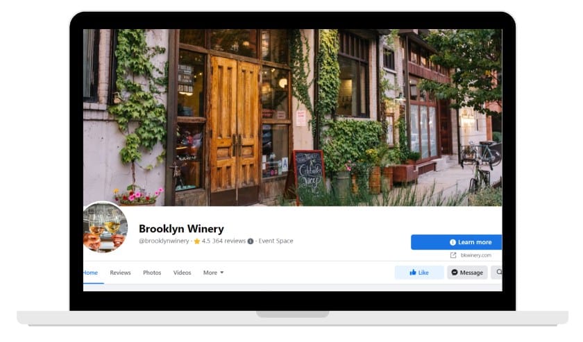
Facebook business page for small business example (Source: Facebook)
Facebook is the leading social networking platform, reaching users of all ages, backgrounds, and interests. Small business social media marketing can be done in various ways on Facebook. For example, you can create a business page that links to your website and provides useful info like hours and reviews, start and participate in private groups, and run targeted ads.
In most cases, users are not there to learn about businesses per se but will often ask their Facebook connections for recommendations and user experiences. Also, ads can be highly targeted, offering businesses an effective way to establish brand awareness and generate sales using paid ads.
Assignment
Create a Facebook page centered around a fictitious company.
Unfortunately, you must first have a standard account to make a Facebook page. This account can be fictitious and contain little or no content. Companies often have their CEO use their profile pages linked to a Facebook company page.

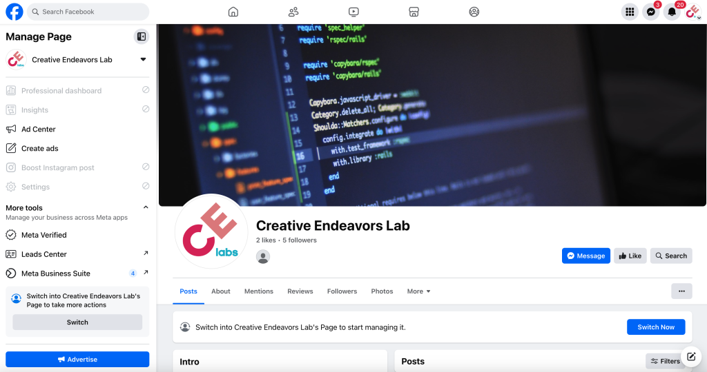
My Sample Facebook Page
The Facebook Page will require you to create a basic look and feel, which includes a logo, banner, and any other graphics and type needed while developing these pages. You must also complete all sections (description, about, etc.) of the page.
Assignment (Facebook Posts)
Please see the checklist on d2l for more information. (A checklist has been created.)
A Review of Facebook Ads.
Source: Facebook Ads Examples – A Curated Selection of Real Ads to Inspire You. (2020). Retrieved from https://adespresso.com/ads-examples/
What’s great about this ad:
-
Remember the importance of concise copy, engaging images, and effective landing pages in online marketing. A short, compelling copy and an eye-catching image can capture attention, while an effective landing page provides detailed information about the product’s value. This strategy can be used by both beginner and established brands in online marketing.
-
Eye-catching image. I don’t know about you, but my thumbs slow down for cute dogs when I’m scrolling through my Facebook feed. This friendly, sleepy dog has nothing to do with the software for sale, but it makes me curious. I might even click on it. Note: there’s a fine line between using cute images of puppies to express the mood of your brand and misleading viewers with clickbait. DON’T do the latter.
-
Effective landing page. If you click on this ad, you’ll be taken to a landing page that describes the product—and why it’s valuable—in more detail. This is a tried-and-true online marketing strategy that even the most beginner brands can use. It’s also a good reminder that you don’t have to say everything in your ad.
What’s great about this ad:
-
Clear and Concise. Without reading the headline or the description, you instantly know who this ad is for and what it’s about.
-
The image reiterates the offer. The image allows the audience to visualize the offer – advertising on the Waze app.
What’s great about this ad:
-
Designed for sound off. Approximately 85 percent of Facebook videos are watched without sound. Headspace’s video uses text and illustration to communicate its message effectively in any environment, making it accessible for viewers with hearing impairments.
-
Short and sweet. At 11 seconds in length, Headspace’s video may seem short, but it’s not. Attention spans are short online, and when it comes to video, advertisers have under two seconds to capture attention. Headspace grabbed mine with the question: “Feeling Awkward?” (The answer is almost always yes.)
-
Simple messaging. In addition to keeping the video brief, the message in the video is clear: Subscribe to Headspace. Sometimes a direct call-to-action is all you need.
What’s great about this ad:
-
The New Yorker’s ad makes a strong impression through effective branding and signature style. The inclusive illustrations in the ad appeal to a broad audience, increasing the likelihood of viewers identifying with the characters. The video’s short length and upfront call-to-action ensure that the message reaches the audience, even if viewers bail early.
-
Inclusive illustrations. In addition to being playful and smart, the series of characters in the video reflect a broad array of potential New Yorker readers. This increases the odds of someone saying, “Hey, that’s me,” and is a hidden form of persuasion. For added inclusivity, the video is also sound-free.
-
Upfront and to-the-point. At only six seconds in length, this video likely has a good completion rate. But even if it doesn’t—a Facebook study finds the majority of viewers bail after 1.7 seconds—the New Yorker’s message will have reached its audience. The call-to-action is present from the moment the video starts.
What’s great about this ad:
-
Product-focused. This video communicates the product and offer in just a few seconds. The bright colors also attract attention against a bland newsfeed background.
-
Free shipping and a bonus offer. Free shipping is usually an eye-catcher all on its own, but by combining it with a bonus coupon, TokyoTreat gives an additional incentive to sign up.
Sent From Adobe Express
Facebook Ads Examples – A Curated Selection of Real Ads to Inspire You. (2020). Retrieved from https://adespresso.com/ads-examples/
