by Jacci Howard Bear The principles of design suggest how a designer can best arrange the various components of a page layout to connect to the overall design and to one another.
All the principles of design, also known as principles of composition, apply to any piece you create. How you apply those principles determines how effective your design is in conveying the desired message and how attractive it appears. There is seldom only one correct way to apply each principle but check your document to see how well you applied each of these six principles of design.
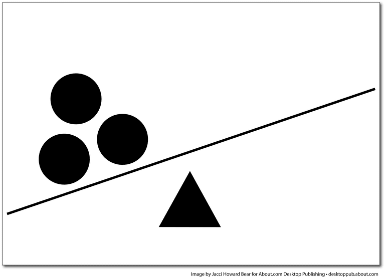
Are your designs in balance Visual balance comes from arranging elements on the page so that no one section is heavier than the other. At times, a designer may intentionally throw elements out of balance to create tension or a certain mood. Are your page elements all over the place or does each portion of the page balance out the rest? If the page is out of balance, it should be done purposely and with a specific intention in mind.
Check Your Use of the Principle of Balance
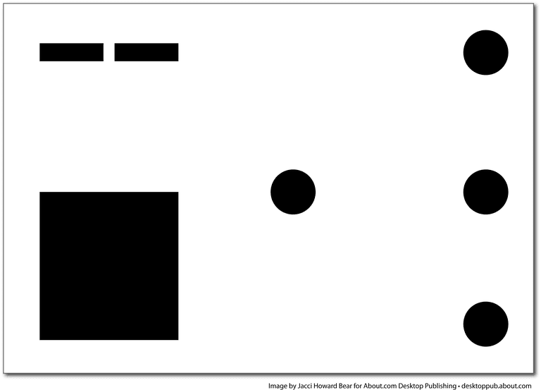
Do your designs have unity? In design, proximity or closeness creates a bond between elements on a page. How close together or far apart elements are placed suggests a relationship (or lack of) between otherwise disparate parts. Unity is also achieved by using a third element to connect distant parts. Are title elements together? Is contact information all in one place? Do frames and boxes tie together or are they separate related elements in your document?
Check Your Use of the Principle of Proximity
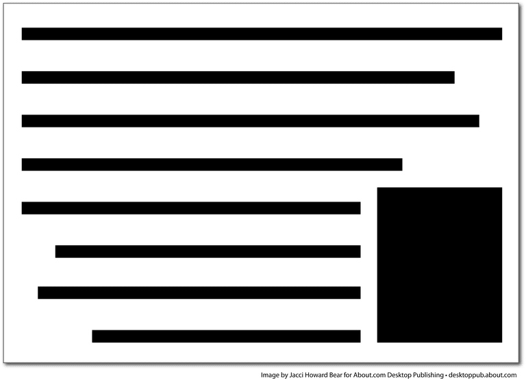 Is your layout in
 with your goals? Alignment brings order to chaos. How you align type and graphics on a page and in relation to each other can make your layout easier or more difficult to read, foster familiarity, or bring excitement to a stale design. Have you used a grid? Is there a common alignment—top, bottom, left, right or centered—between blocks of text and graphics on the page? The text alignment should aid readability. If certain elements are out of alignment, it should be done purposefully with a specific design goal in mind.
Check Your Use of the Principle of Alignment
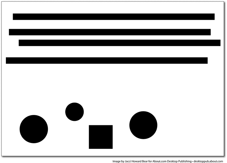
Do your designs exhibit consistency?Repeating design elements and consistent use of type and graphics styles within a document shows readers where to go and helps them navigate your designs and layouts safely. Ensure that your document utilizes the principles of repetition, consistency and unity in page design. Do page numbers appear in the same location from page to page? Are major and minor headlines consistent in size, style and placement? Have you used a consistent graphic or illustration style throughout?
Check Your Use of the Principles of Repetition and Consistency
 ](https://image-control-storage.s3.amazonaws.com/blog-images/2017/09/27184057/contrast-58babbd33df78c353c433413.png) Do you have good contrast among components of your design?In design, big and small elements, black and white text, squares and circles, can all create contrast in design. Contrast helps different design elements stand out. Is there enough contrast between the text size and color and background color and pattern to keep text readable? If everything is the same size even when some elements are more important than others, the design lacks contrast.
Check Your Use of the Principle of Contrast
 Do you have white space in the right place? Designs that try to cram too much text and graphics onto the page are uncomfortable and may be impossible to read. White space gives your design breathing room. Do you have enough space between columns of text? Does text run into frames or graphics? Do you have a generous margin? You can also have too much white space if items float on the page without any anchor.
Other designers and instructors may include principles such as harmony, flow, or hierarchy in addition to or in place of some of these principles of design. Some principles may be combined or go by other names, such as grouping (proximity) or emphasis (use of various other principles to create a focal point). These are different ways of expressing the same basic page layout practices.
Good graphic design is no accident
By
Graphic design is the art and science of combining text and graphics to communicate an effective message in the design of websites, logos, graphics, brochures, newsletters, posters, signs, and other types of visual communication. Designers achieve their goals by combining the elements and principles of graphic design. Some concepts, such as contrast, are both elements and principles: the former, as a visual characteristic; and the latter, as the technique employed by it.
In addition to the obvious ones such as images and type, graphic design elements include lines, shapes, texture, value, size, and color. Graphic designers for print and web pages use some or all of these elements to generate effective designs. The goal is usually to attract the viewers’ attention and, sometimes, to motivate them to take a specific action.
Lines are the most basic of the design elements. Lines can be straight, curved, thick, thin, solid, or not solid. They are used to connect two points, separate sections of a design, and focus the user’s eye. Their qualities create emotion, movement, organization, and more. For example, a jagged line conveys emotion; a line that ends in an arrow forces the viewer’s eye to look in a specific direction. A line that meanders among several elements guides the viewer from one element to the next and onward through the page.
The basic geometric shapes are squares, circles, and triangles. They form boxes or borders on a design or solid shapes for decorative purposes. Icons, symbols, and dingbats are also considered shapes, and they add interest and clarity.
Certain graphics techniques, such as the use of rhythm and shadow, create texture—the visual “feel” of an element. Texture can serve as a background, enhance overall appearance, and add character to other elements such as type and images.
Color attracts attention and conveys emotion and mood. For example, red represents strength, anger, or passion. Blue invokes peace, professionalism, or security.
Value is a measure of darkness and lightness in an element or design. Value creates contrast and emphasis. For example, a light object against a dark background draws the viewer’s eye.
:max_bytes(150000):strip_icc():format(webp)/simultaneous-contrast-56a6e5675f9b58b7d0e55ed2.jpg)
The size of an element in graphic design generally indicates its importance. The most important information is typically the largest on the page and draws the viewer’s attention first.
Most good graphic designs achieve visual balance by using symmetrical, asymmetrical, or radial symmetry around a visual center.
In symmetrical balance, both sides of a page layout are the same in weight, shape, lines, and other elements.
Asymmetrical balance occurs when the two sides of a website aren’t the same, but they have similar elements.
Radial symmetry places elements in a circular pattern. Although it is popular in print layouts, radial symmetry isn’t seen much on websites because the circular placements are difficult to achieve.
Occasionally, a graphic designer intentionally produces an unbalanced design, usually to focus attention on a single element. In design, as in other areas, you need to know the rules before you can break them effectively, but unbalanced designs can work.
Alignment refers to lining up the elements of a design along the top, bottom, center, or sides of the elements. The aligned elements don’t have to be of the same type. They are frequently aligned along the left edge of the layout. Different-size photos appear as a unit when they are aligned across the top or the bottom.
Repetition duplicates the characteristics of similar elements to contribute to design consistency. Repetition can also create rhythm in a design. A series of bulleted points of interest in the same color, type, and size appear as a complete unit.
:max_bytes(150000):strip_icc():format(webp)/bulletsingraphicdesign-c5b790e163db4763932eb7872f786227.jpg)
Proximity maintains a relationship between items that go together. The elements don’t have to be positioned closely together, but they should be connected visually.
Contrast occurs when opposing elements are juxtaposed: big versus small or dark versus light, for example. It can highlight important elements of a design. Contrast is easily achieved with color, but it can also occur with texture, type, and graphic elements.
Space is the part of a design that is left blank. Negative space is intentionally placed in the design. The margins and gutters between other elements are referred to as passive space. Space in a design adds emphasis to an area because the eye gravitates to the part of the design that is not empty. Effective graphic design takes into account both positive and negative space.