Simple Grids
Posted on: Jul 13, 2020Tags: design, grid
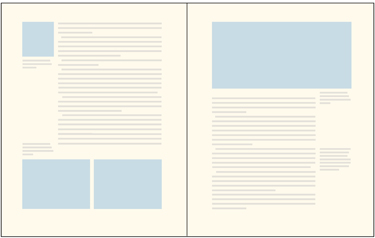
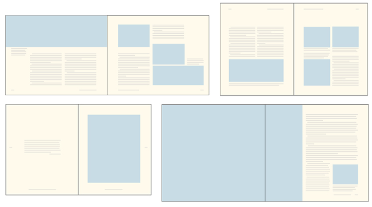

A Basic Theory Of Grids
Whether you work in print or in web and mobile design, you need to understand the basics of grid theory.
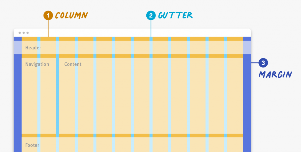
ANATOMY OF A GRID
Whether simple or complex, all grids have some common parts:
-
Format
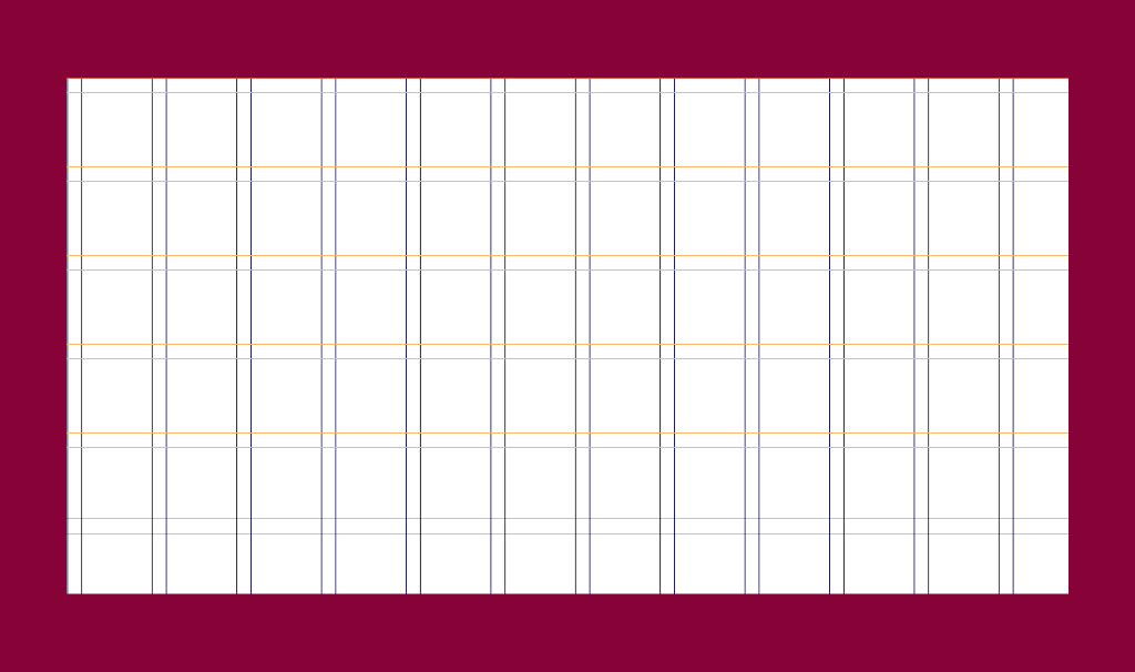
The format is the area in which the design is placed. In a paper book, the format is the page. On the web, the format is the size of the browser window. -
Margins
Margins are the negative space between the edge of the format and the outer edge of the content.

Margin for a block of content
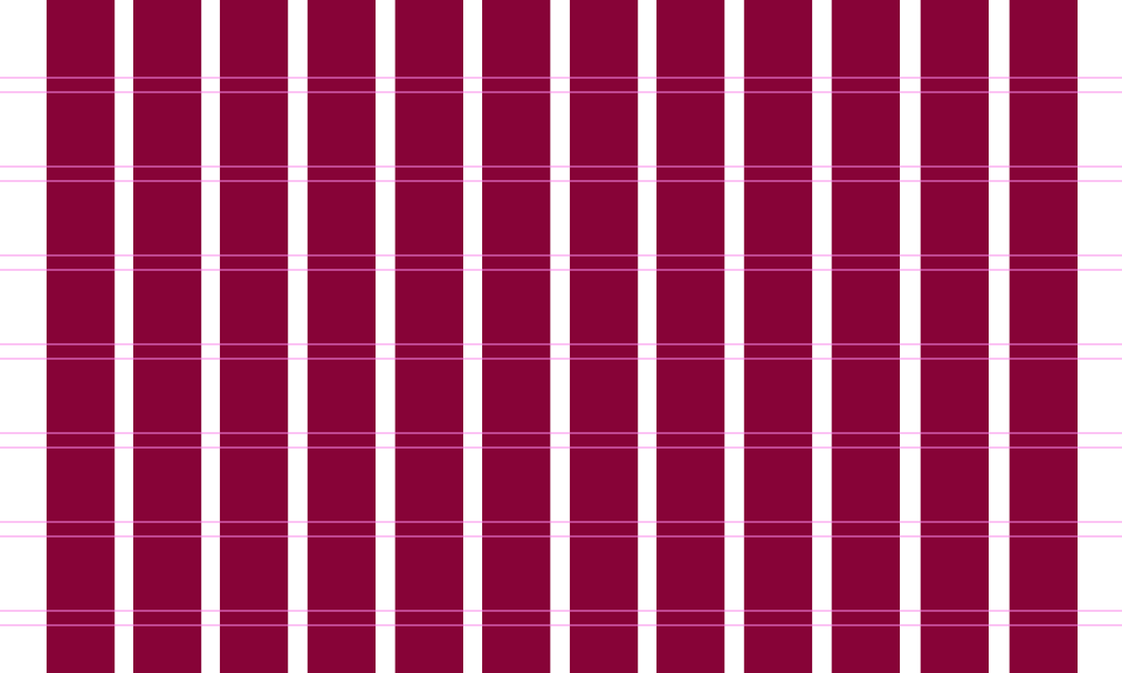
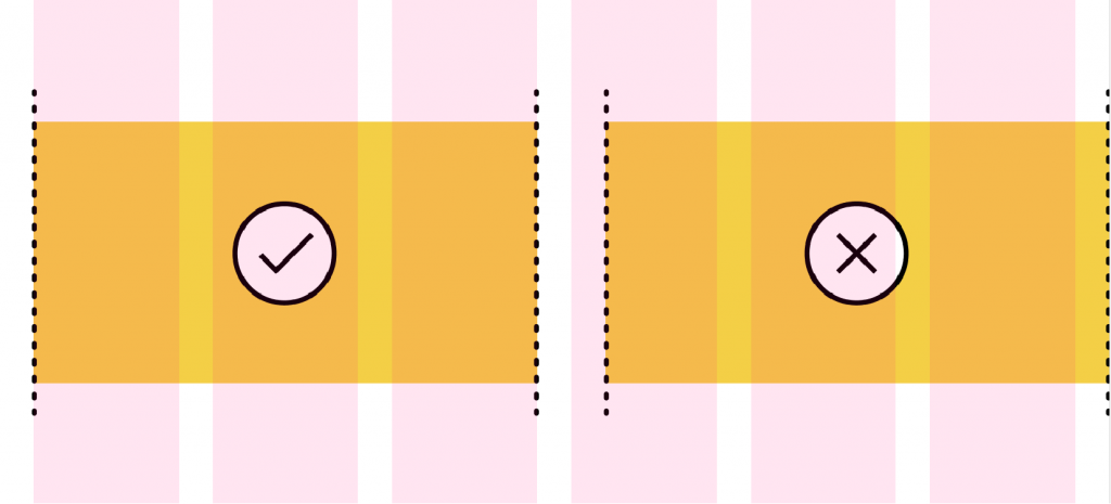
- Columns and Alleys
In its most basic form, a grid is made up of two main components: columns and alleys. Columns are the building blocks of grids. The space between columns is referred to as alleys. Together, columns and alleys take up the horizontal width of the screen.
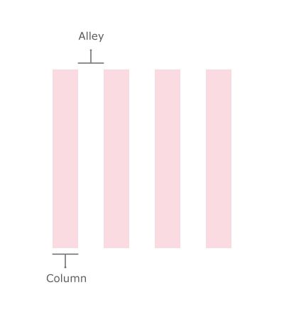
The space between columns is referred to as alleys.
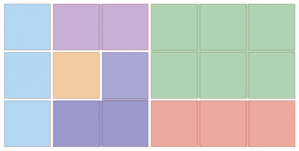
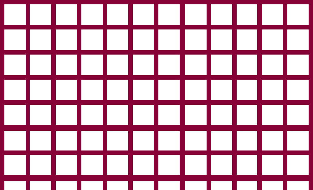
- Modules
Modules are individual units of space created from the intersection of columns and rows (i.e., the horizontal equivalents of columns).
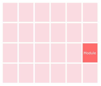
Modules are units created from the intersection of rows and columns.
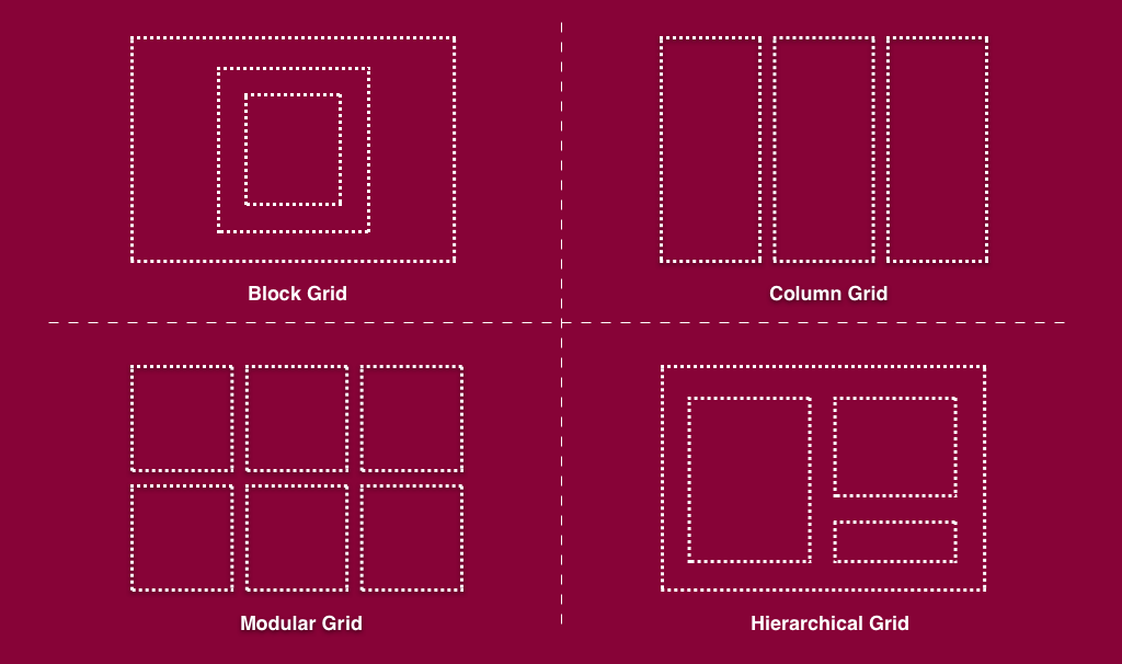
1. Know Your Grid Anatomy

1. Columns
2. Rows

3. Modules

4. Gutters
5. Margins
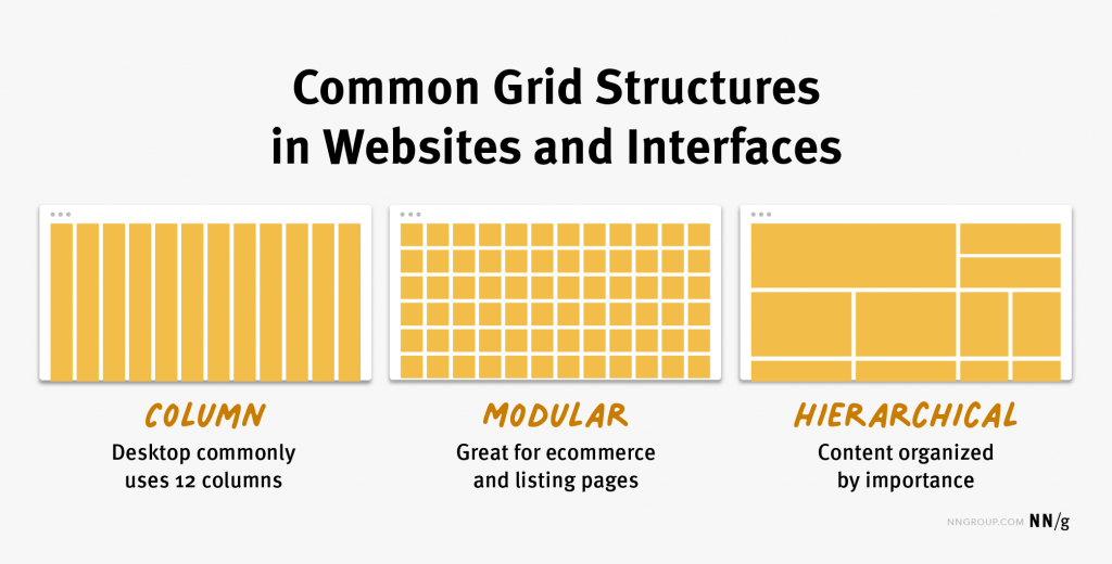
2. Choose the Right Grid Layout


Using Grids in Interface Designs Building Better UI Designs with Layout Grids