…Professional-looking fonts certainly don’t need to be dull!
Particularly if you’re designing marketing or branding materials for a creative individual or company, you want the typeface to strike the perfect balance of minimal professionalism and look-at-me creativity.
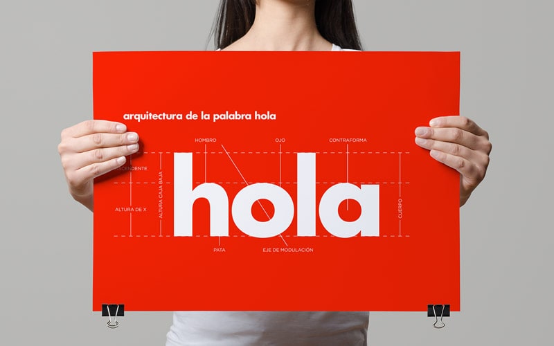
When Art Director Iñaki Saiz Roiz came to design the branding for architect Laura Solana, he turned to Futura Bold to give the logo and stationery a clean yet modern look.
Teaming a pair of fonts together, one more corporate, the other more decorative, can be a great choice for designing brands for more creative companies.
Here, for an Artist Management company, Australian Designer Matt Vergotis paired a clean sans serif for the bulk of text with a more decorative calligraphic typeface in the main logo. It makes for a really successful typographic team, and is a great formula to follow for your own brand designs—choose a calligraphic or brushstroke font that looks slick and modern, and pair with a more conservative sans serif. Job done!
For a similar look to the decorative calligraphic font used here, try out the classic-yet-modern Dynalight or the retro-inspired Yellowtail.
For the cleaner, corporate typeface, Matt used Ubuntu.
The retro revival in typography keeps getting stronger by the day. An added bonus—retro fonts can give your brand designs a touch of nostalgia, which makes the brand seem instantly more appealing and emotive to the customer.
The key to using retro-inspired fonts successfully in creative branding is to keep them looking fresh and modern. None of those scratchy vintage textures or distressed effects—keep them crisp and polished for a corporate-appropriate vibe.
Also from Australian Designer Matt Vergotis comes this fantastic demonstration of using retro fonts in a modern way, for web development company Betafirm. To imitate the font, give Lobster a whirl, or take Pacifico for a spin.