Magazine spreads, book pages, flyers, websites, and other text-based designs will always benefit from a well-chosen font pairing. But if you’ve never paired fonts before, where to begin?
This guide shows you five easy ways* to create a failsafe font combination every time and suggests appropriate ways to use each font pairing style. Read on to find your font dream team…
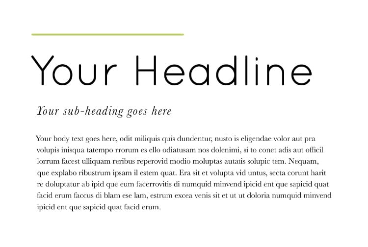
* These five font pairings are based on using one font for the headline (the main title on your page) and another font for the body text (the longer paragraphs which make up the bulk of content on your page). If you want to add sub-headings or pull-out quotes, setting text in an italic weight is always a wise move, or try using a bold or condensed version of your body text font to add contrast while keeping the typography looking polished.
This is the most common font pairing style designers will use when they want to make their typography look instantly more polished and professional. Why does this font pairing work so well?
Within this font pairing style, you’ll find that certain sans serifs look better teamed with particular serifs. Start by choosing a headline sans serif you love and experiment with serif options for body text.
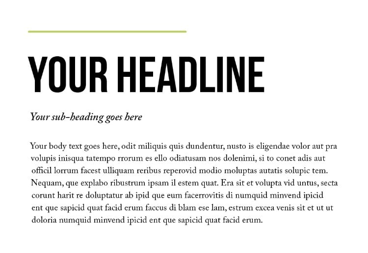
One of our favorite font pairings is headlines set in Bebas Neue with body text set in Caslon. A sub-heading set in Adobe Caslon Pro Italic adds the perfect finishing touch.
Most fonts belong to a typeface family—a group of fonts that vary in weight (e.g., bold, italic, book, etc.) but ultimately share the same base design. Superfamilies include even more stylized variations, such as condensed or expanded styles.
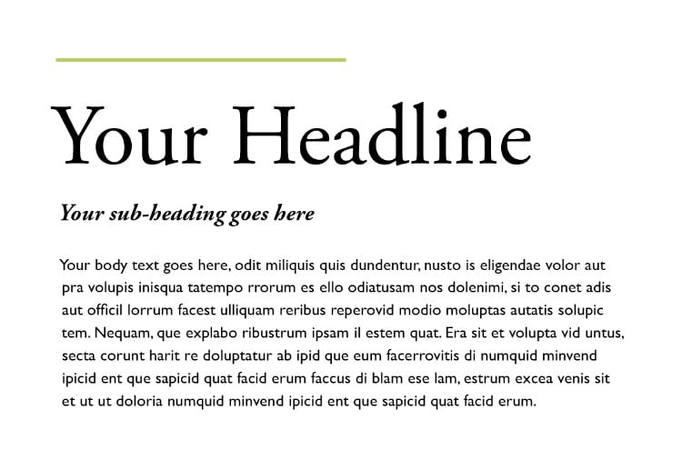
Pairing fonts from the same family is a quick route to creating a cohesive and elegant design. This pairing calms the eye, perfect for more traditional or formal layouts.
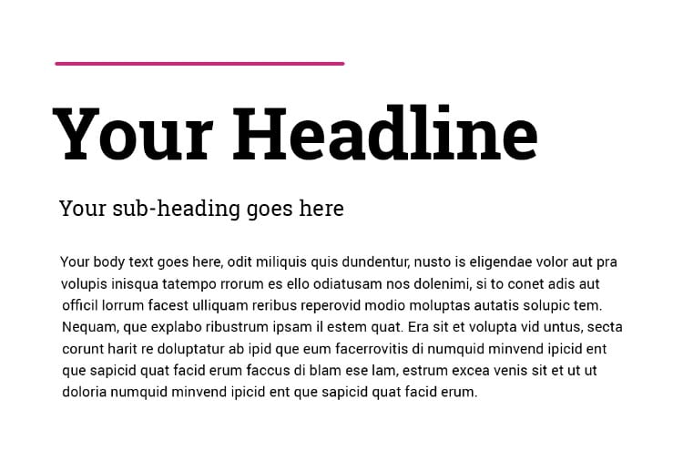
We love the combination of a Roboto Slab headline with Roboto body text. The different weights offer plenty of variation to keep designs playful.
Every font carries a personality. Designers often group fonts that evoke a similar “mood” or “vibe.” This professional concept makes pairing easier.
Examples include:
Display fonts are designed to grab attention and look incredible when paired with subtler body text like Humanist or Transitional styles.
An excellent example: Scala Sans Black headlines paired with Gentium Basic.
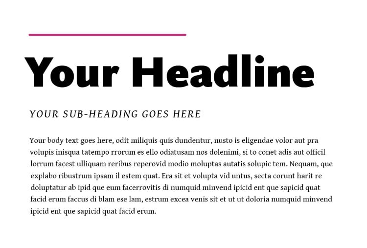
Rounded sans serifs offer a youthful, modern vibe. Pairing them with a traditional serif creates a striking contrast.
For example, Quicksand headlines combined with Garamond create a futuristic yet clean design.
Use these guidelines to craft beautiful, readable layouts that leave a lasting impression!