![]https://www.canva.com/learn/wp-content/uploads/2015/09/Gestalt-Theory-And-The-Design-Principles-It-Gave-Birth-To-tb-962x0.png)


Great designers understand the powerful role that psychology plays in visual perception.
What happens when someone’s eye meets your design creations? How does their mind react to the message your piece is sharing? As an amateur or professional designer, it’s important that you can answer these questions.
Understanding how a design is perceived and interpreted is a crucial asset that visual communicators must possess. We cannot possibly influence human perception with our designs if we don’t understand the driving forces behind them.
In this article, I’ll share the basic principles behind Gestalt, a psychology movement that evolved to help us understand how viewers make sense of the visual stimuli that we design for them.
The word Gestalt is German, and literally stands for a pattern, figure, form or structure that is unified. Gestalt Psychology, a movement that took off in Berlin back in the 1920s, seeks to make sense of how our minds perceive things in whole forms, rather than their individual elements.
To understand what Gestalt Psychology attempts to explore and unpack, think of how your mind automatically perceives the face of a person you know well. This is so even though the face is no doubt made up of the same core features as any other: nose, ears, eyes, etc. What your mind does — the making sense of the features as a whole — is where Gestalt Psychology finds its focus.
Ever heard of Pavlov’s dogs? Pavlov was a Russian psychologist active from the late 1890s. He (accidentally) founded the idea that we could influence behavior by using rewards (he used food as the reward and tested its impact on the behavior of his dogs). The theory was known as classical conditioning, and it still impacts the world of marketing and design today. Gestalt psychologists, unlike their colleagues, thought that processes like perception, learning and cognition weren’t that simple, and couldn’t be understood by splitting them in parts. Instead, Gestalt psychologists were interested in complex ideas like insight, holism and problem-solving; and, if you’ve been in the design world for enough time, you probably are too.
Soon after it was introduced in psychology, Gestalt was applied to the field of visual perception by theorists like Max Wertheimer, Wolfgang Kohler and Kurt Koffka. The main idea was that when we perceive the world there are many different signals coming in at the same time. To organize them, and avoid going crazy, we visualize our surroundings as unitary forms or groups. Just how we go about deciding that some objects “go together” would be the main obsession of Gestalt psychologists and designers for decades to come.
Over the years, Gestalt psychologists have come up with lists to summarize basic principles of visual perception, which have become invaluable tools for designers. As mentioned above, these principles try to explain when and how our minds perceive different visual components as being part of the same group. The principles explained below are a combination of those proposed originally by Max Wertheimer (1923), Stephen Palmer (1999, 2002), and other contemporary Gestalt theorists.
The law of simplicity indicates that our mind perceives everything in its simplest form. The image below, for example, when studied in depth is made up of individual components that have no meaning when viewed separately, yet our mind automatically perceives them in combination to spell out the word ‘logo’.

It’s important for designers to understand the law of simplicity because when it’s combined artfully with creativity, the two can be harnessed to produce truly stunning designs. Mastering design simplicity requires you to balance two often competing considerations: the use of uncomplicated shapes and objects and the need to produce striking design effects. This example does it perfectly — using simple elements and objects in combination to produce a unique and captivating representation of a guitar.

Essentially, simplicity is about helping the eye find “comfortable” figures used to trigger an interpretation of what we are trying to show.
The figure-ground principle helps to explain which element in a design will immediately be perceived as the figure and which will be perceived as the ground. The “figure” is the element in focus, while the “ground” is the background behind the figure.
There are two other related principles you will need to understand before you will be able to answer this question:
When you look at the image below, your perception of which is the figure and which is the ground alternates depending on how your mind perceives it. In one instance, it appears as if the black hand is the figure and the white is the ground, and in another it appears as if the white head is the figure and the black is the ground.
[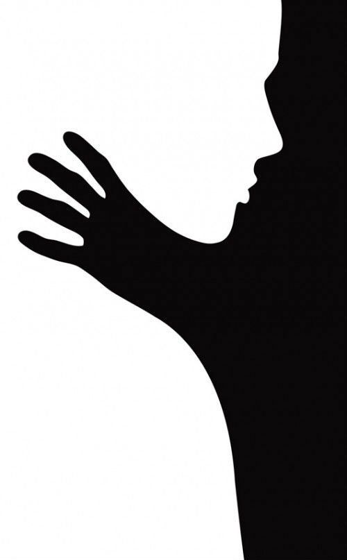
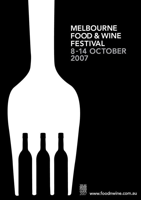
Applied in design, figure-ground can make a significant difference in the way your piece communicates a message. In this ad for Melbourne’s Food & Wine Festival (2007), the wine bottles are strategically placed to create the illusion of a fork. In combining objects related to wine and food, this design conveyed the event’s message much more compellingly.
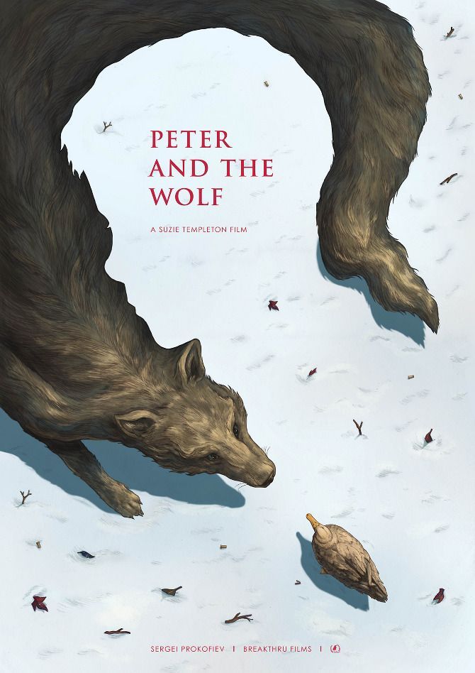
This poster for the film “Peter and The Wolf” exemplifies the great creative potential in using the figure-ground principle to your benefit. On one hand, you get the image of a long wolf’s body. When you shift to looking at the white in the image (previously ground) as figure, you immediately spot a man’s silhouette — which we can assume is Peter’s.
 ]
]
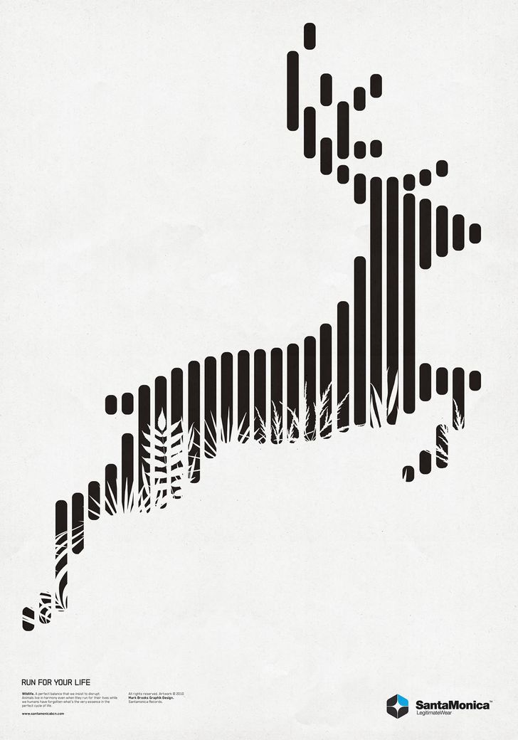
We perceive elements as belonging to the same group if they are laid out close together. As an example, think about how proper kerning can help the eye understand which letters make up individual words. In some cases, excessive spaces between letters can cause confusion as to when one word ends and the next begins. In the example below, our mind perceives each of the proximate vertical bars to combine and form a single image of a deer.
The principle of proximity is also effectively applied in Unilever’s logo. Since the small figures are laid out closely to each other, you can easily perceive the cluster as a U (in Unilever). According to their brand site, their logo was designed to include “25 icons, each of which represents something important to Unilever”.

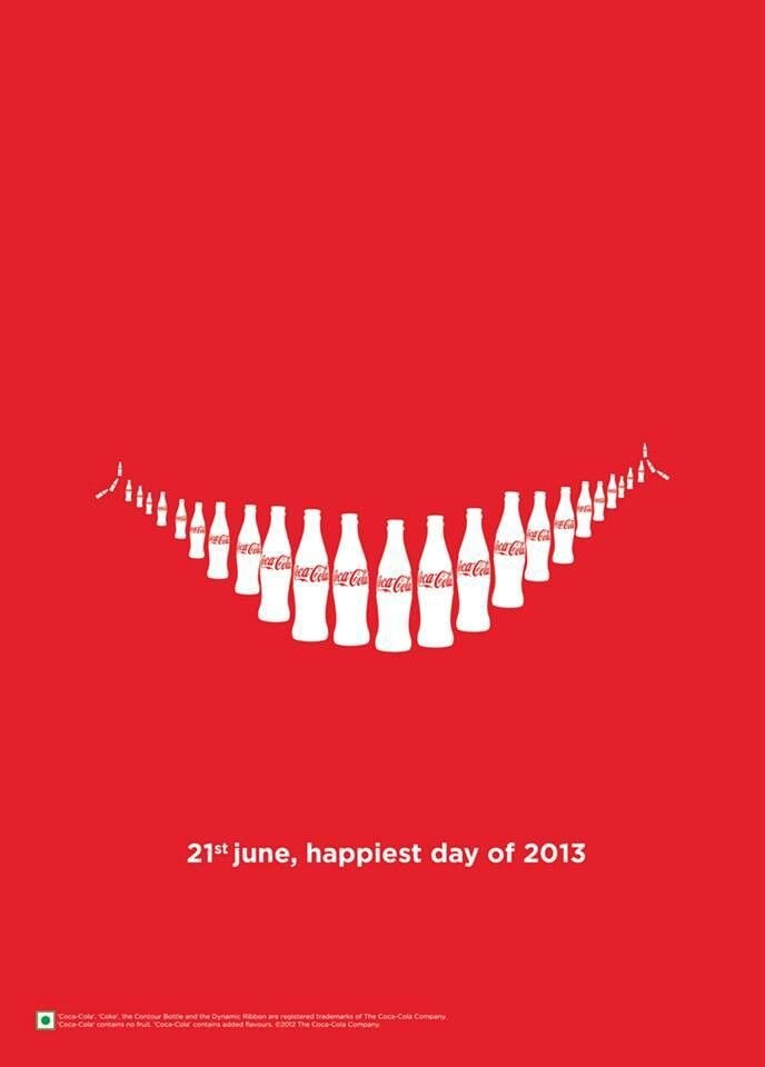
In the poster below, Coke wanted to convey happiness (one of its core brand values) by creating the shape of a smile using bottles. The fact that they are placed near each other in such a deliberate fashion helps the viewer perceive that smile.
We perceive elements as belonging to the same group if they look like each other. The principle of similarity can be triggered using color, size, orientation, texture and even fonts. When laying out a multi-page document, for example, creating a strong type scheme will help readers understand which chunks of text are captions, which are headlines and which are body copy.
In the image below, our mind perceives the similarly colored circles not as individual circles but as combining to form rectangles, squares and lines separate from those of another color.
When visual elements move together in the same direction, we see them as part of a single group. Our eye is drawn towards figures that are moving together, and this principle is particularly important for 2D and 3D animations.
In the image below, because each of the individual birds are travelling in unity in the same direction our mind perceives them as forming part of a single group, carrying away a captured fish.
In this poster for Street Scene, an American opera by Kurt Weill, the grey letters are perceived as part of the same content block (title) because they are not only similar (see Similarity principle above), or tightly kerned (Proximity above), but also apparently moving in the same direction.
Symmetrical elements are perceived as part of the same group. Have you ever looked at figures that look like mirror reflections of each other? This relationship helps us perceive these elements as a single figure.
In this poster for the Bike Expo in New York, the design concept aimed for a unified circle as the main focal point. To create the circle, the designer portrayed one half as a bike wheel and one half as a manhole cover. While different in texture and color, the fact that they resembled a symmetrical figure unified them in the eyes of this poster’s audience.
Elements with the same or very similar slopes are associated as a single group. When designing, we often change the inclination of our texts to match surrounding arrows or curves because it makes the entire figure look more visually compact. In this poster created to advertise the font Futura, different text areas are grouped using the principle of parallelism.
Elements are visually associated if they are aligned with each other. Lines are perceived as a single figure insofar as they’re continuous. The smoother their segments are, the more we see them as a unified shape.
This Christmas card by Publicis Singapore portrays how the principle of continuity can help us create shapes. The sharpened pencil’s thin green line helps guide the eye from the top of the composition to the bottom, creating a christmas tree shape in a very unexpected way.
We perceive elements as belonging to the same group if they are part of a closed figure. A great opportunity to explore the closure principle is logo design. Fedex’s logo “hides” a right arrow that not many have been able to spot throughout the years. By creating that negative space between the E and the X, and adding the illusion of closure by kerning the two letters very tightly, the arrow becomes visually apparent:
When we find several elements that are part of a single region, we associate them as a single group. Consider a design for a badge where there is a combination of text, objects and a banner. All three of those elements are perceived as belonging to the unified badge.
In this poster for Pixar’s Inside Out, artists Stacey Aoyama and Eric Tan use the common region principle to unify the movie’s characters inside a single human silhouette. As we visualize them inside the same region, we perceive them as coexisting within that space. If you’ve watched the movie, you know that this is largely its goal: to show that positive and negative emotions coexist in our minds to shape our behavior.
We perceive elements as being united if they are connected by other elements. An easy way to think about this principle in action is an infographic or flowchart where arrows help connect one figure (or text block) to the next.
In these pieces by Jonathan Calugi for Harvard Magazine, the objects are unified by a line that runs through the entire composition — bringing unity and a sense of visual cohesion despite the amount of activity.
Ready to bring strong psychology principles to your design work? Next time you are creating a composition, think about how proximity, simplicity, similarity and other principles outlined above impact your audience. Don’t be afraid to experiment!
</div></div></div></article><section class="post-call-to-action post-call-to-action-c4w"><div class="row"><div class="col7"><div class="give-it-a-try-c4w-inner "><div class="text">## Great design for
every part of your life
</div></div></div></div></section><section class="author-wrapper"><div class="row"><div class="col7"><div class="author-info"><div class="author-avatar"></div><div class="author-name"><div class="author">Laura Busche</div></div></div><div class="author-description">Laura (@laurabusche) is a Brand Content Strategist and regularly blogs about branding and business at laurabusche.com/blog. Laura earned a Master of Arts in Design Management from the Savannah College of Art and Design (SCAD). She is the author of O’Reilly Media’s Lean Branding book.
</div></div></div></section>