![]()
Sentinel with Tungsten and Verlag
Is there a way to know what fonts will work together? Building a palette is an intuitive process, but expanding a typographic duet to three, four, or even five voices can be daunting. Here are four tips for navigating the typographic ocean, all built around H&FJ’s Highly Scientific First Principle of Combining Fonts: keep one thing consistent, and let one thing vary.

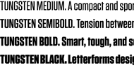
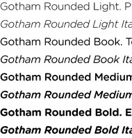
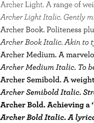
It’s the interplay between fonts that gives them energy. The more distant the moods in a typographic palette, the friskier the design will be. Here, three fonts with distinctive silhouettes have been chosen for their contrasting dispositions: the unabashed toughness of Tungsten is a foil for both Archer’s sweetness, and the cheekiness of Gotham Rounded.


![]() Tungsten from $99
Tungsten from $99
![]() Gotham Rounded fr. $179
Gotham Rounded fr. $179
![]() Archer from $149
Archer from $149

Three type families with nineteenth century roots, thrown together in a cheerful typographic riot. Choosing type families with different features helps prevent redundancy: here, the brawny variations of The Proteus Project are reserved for headings, Sentinel’s six weights of romans and italics recommend it to text, and Knockout’s nine different widths helps the sans serif fill in the cracks.


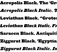
![]() Proteus Project from $99
Proteus Project from $99
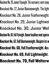
![]() Knockout from $169
Knockout from $169
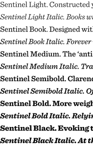
![]() Sentinel from $199
Sentinel from $199

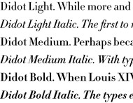
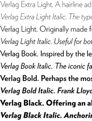
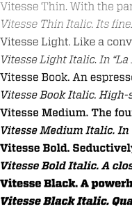
What do a neoclassical modern, a suave sans serif, and a sporty slab have in common? All are meditations on precision, though each has a different texture. H&FJ Didot achieves its crispness through the thinnest possible serifs, Verlag through its insistently geometric motifs, and our new Vitesse typeface through its pairing of machined edges and racy curves. Together, these three mechanical faces create a dramatic typographical tension.