### In **Part Two** of this [**two-part**](http://www.indesignskills.com/skills/create-a-magazine-in-indesign-one/ "Create a Magazine Part One of Two") tutorial, ***Create a Magazine in InDesign***, we’ll build on the Masters we created in Part One, and get creative with the layout of our first feature for ‘Foodie’ magazine.
- ### **Learn how to use a grid as a guide for placing text and images**
- ### **Get creative with typography to create a vibrant, eye-catching layout**
- ### **Develop an eye for grouping and displaying images for a professional-standard layout**
---
---
### **What you’ll create:[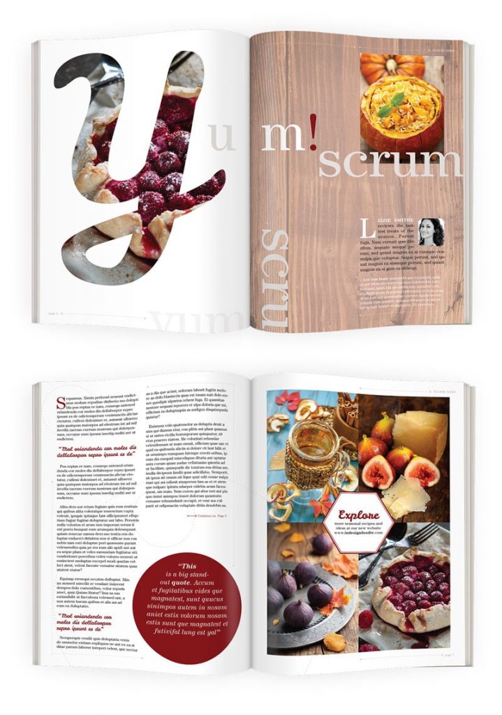](http://www.indesignskills.com/wp-content/uploads/2014/09/Intro-Image_.jpg)**
In this two-part tutorial we’ll be creating **two complete spreads**. [**Sign up**](http://www.indesignskills.com/get-your-free-indesignskills-ebook/ "Get your FREE InDesignSkills eBook") to our mailing list to be alerted when the **full Magazine course** becomes available.[ ](http://www.indesignskills.com/wp-content/uploads/2014/07/Intro-Image.jpg)
---
### **1. Select Images and Fonts for your Magazine Feature**
---
### **Step 1**
---
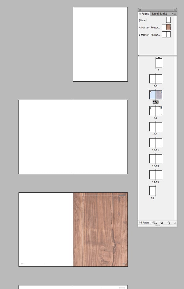
Let’s get started. **Open InDesign**. Go to **File > Open** and select *Foodie Magazine Inside Pages.indd,* which you saved at the end of [**Part One**](http://www.indesignskills.com/skills/create-a-magazine-in-indesign-one/ "Create a Magazine Part One of Two") of the tutorial.
You have a **16 page** document, with **Facing Pages**. The ***A-Master*** has been applied to pages **4**and **5** of the document, while the ***B-Master*** has been applied to pages **6** and **7**.
[](http://www.indesignskills.com/wp-content/uploads/2014/10/1.11.jpg)
Navigate down to page **4** of your document.
We’re going to apply a really fantastic typographic effect on this page, but before we do that we need to source a selection of photos that we can use across the whole feature. The images need to work well together, not only in terms of subject matter but also in terms of colour and quality. It’s a good idea to look for images which you can reuse, which can have a different ‘look’ if you show just the right-hand side, or the top left corner of the photo, for example.
These are the images I’ve used in this tutorial. You can download these by clicking on the links below, or pick similar images of your own preference:
[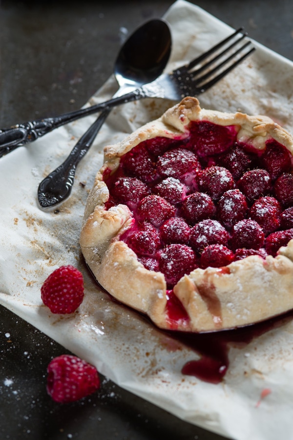](http://www.indesignskills.com/wp-content/uploads/2014/10/ISS_8706_00267.jpg)
[**An autumnal tart**](http://www.ingimage.com/imagedetails/67222400_extInt0/ISS_8706_00267-Isignstock-Contributors-Autumn-dessert-raspberry-galette-with-cream-cheese.html)
[](http://www.indesignskills.com/wp-content/uploads/2014/10/ISS_1183_06842.jpg)
[**A portrait of a woman**](http://www.ingimage.com/imagedetails/44281781_extInt0/ISS_1183_06842-Isignstock-Contributors-Close-up-portrait-of-a-beautiful-fitness-woman-wit.html)
[](http://www.indesignskills.com/wp-content/uploads/2014/10/ISS_11071_03230.jpg)
[**A rustic pot of honey**](http://www.ingimage.com/imagedetails/77045518_extInt0/ISS_11071_03230-Isignstock-Contributors-Cider.html)
[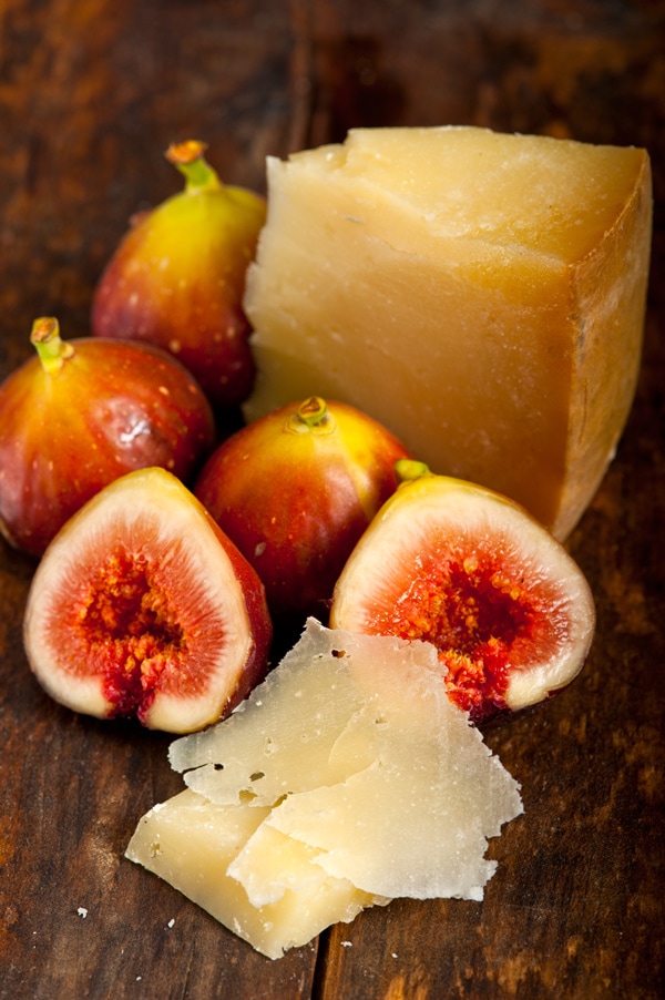](http://www.indesignskills.com/wp-content/uploads/2014/10/ISS_2042_05813.jpg)
[**Figs and a slab of cheese**](http://www.ingimage.com/imagedetails/67795492_extInt0/ISS_2042_05813-Isignstock-Contributors-italian-pecorino-cheese-and-fresh-figs-macro-close.html)
[](http://www.indesignskills.com/wp-content/uploads/2014/10/ISS_5130_05327.jpg)
[**Purple figs on a metal platter**](http://www.ingimage.com/imagedetails/69362682_extInt0/ISS_5130_05327-Isignstock-Contributors-fresh-figs-and-autumn-leaves.html)
Once you’ve sourced your images, return to InDesign and go to **Window > Mini Bridge** (from CS6 onwards) to open **Mini Bridge**. From here, you can navigate to your folder of images and drop them in to your layout with ease.
---
### **Step 2**
---
We’ll also need to select a couple of typefaces to use in our layout. In most magazines you will notice that a standardised ‘brand’ font will be used uniformly throughout the publication. This will be applied to body text, page numbers, running headers and some titles. In this tutorial we will use **ITC Century Std**, which we’ve already used for the page numbers on our Master pages.
It’s also a great idea to pick out a font which has a more decorative style, which you can use for the feature title and quotations. In this tutorial I’ve used the free font [**Leckerli One**](http://www.fontsquirrel.com/fonts/leckerli-one), which has a cheerful retro aesthetic.
---
### **2. Create a High-Impact Text Effect for the Opening Page**
---
### **Step 1**
---
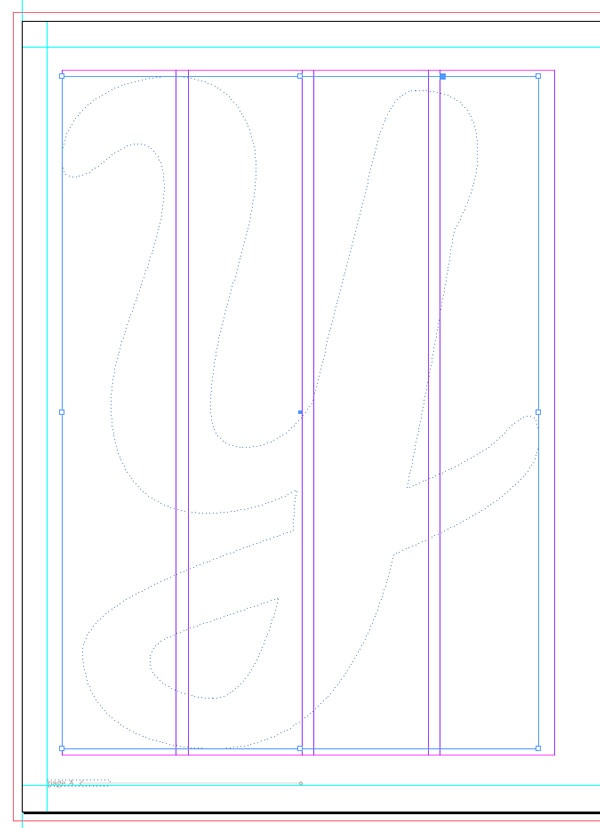
Remaining on **Page 4** of your InDesign document, select the **Type Tool (T)** and drag to create a large text frame that extends across most of the page.
Type **Y** into the frame and set the **Font** to **Leckerli One**, **Size 650 pt.** With the text frame selected, go to **Type > Create Outlines** to convert the letter into a shape.
[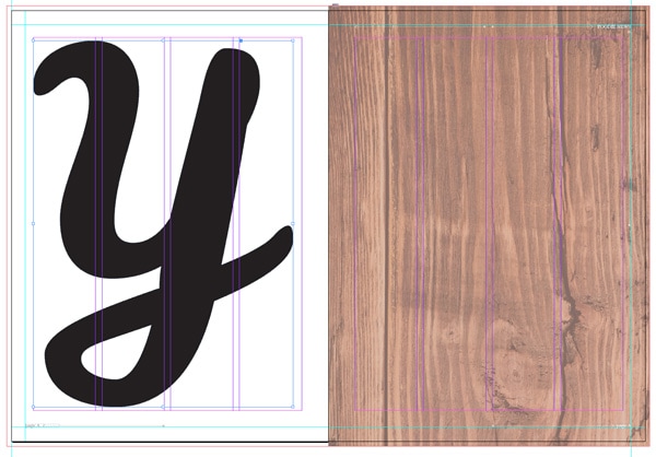](http://www.indesignskills.com/wp-content/uploads/2014/10/2.11.jpg)
From the control panel running along the top of the screen, adjust the **Fill Colour** of the letter to **\[None\].**
[](http://www.indesignskills.com/wp-content/uploads/2014/10/2.1.1.jpg)
---
### **Step 2**
---
Either drag and drop an image from **Mini Bridge** onto the shape, or, with the shape selected, go to **File > Place** and select an image. Your chosen image will fill the letter. Select **Fill Frame Proportionally** from the top control panel to arrange the image in the shape.
[](http://www.indesignskills.com/wp-content/uploads/2014/10/2.1.2.jpg)[![magazine layout design indesign typography]()](http://www.indesignskills.com/wp-content/uploads/2014/10/2.1.3.jpg)
Ta-dah! A super easy but really effective technique for bringing high-impact to your magazine feature.
---
### **3. Build up the Layout of your Opening Spread**
---
### **Step 1**
---
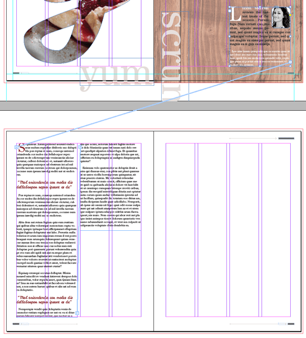
Navigate to the bottom right corner of **Page 4.** Select the **Type Tool (T)** and drag to create a new text frame about **38 mm** in **Height** and **103 mm** in **Width.** Type *‘yum’* into the frame and set the **Font** to **ITC Century Std Book, Size 150 pt**, and **Font Colour** to a new **CMYK Swatch**, **C=0 M=10 Y=11 K=34**, a sandy beige colour.
Open the **Swatches** panel **(Window > Color > Swatches)** and adjust the **Tint** percentage to **35%.** Position the text frame as shown.
[![magazine layout design indesign typography]()](http://www.indesignskills.com/wp-content/uploads/2014/10/3.11.jpg)[![magazine layout design indesign typography]()](http://www.indesignskills.com/wp-content/uploads/2014/10/3.1.1.jpg)
With the text frame selected, go to **Edit > Copy** and **Edit > Paste.** Repeat two more times and adjust the text content of each frame to read *‘u* (space x 2) *m’*, *‘scrum!’* and *‘scrum’.*
You can rotate one of the text frames by **Right-Clicking (Windows) or Ctrl-Clicking (Mac OS) > Transform > Rotate 90 degrees Clockwise.**
Introduce a couple of new colours via the **Swatches** panel, changing the **Font Colour** of some characters to **\[Paper\]** and others to a reddy-brown swatch, **C=28 M=100 Y=97 K=34.**
Manoeuvre the frames into the positions indicated below.
[![magazine layout design indesign typography]()](http://www.indesignskills.com/wp-content/uploads/2014/10/3.1.2.jpg)[![3.1.3]()](http://www.indesignskills.com/wp-content/uploads/2014/10/3.1.3.jpg)
---
### **Step 2**
---
Navigate to **Page 5** of the spread and hit **W** on the keyboard to switch the **Screen Mode** to **Normal**, if not in that mode already. You can now see the guides marking out the columns on the page.
Select the **Type Tool (T)** and drag to create a small text frame **84 mm** in **Width** and **80 mm** in **Height.** Position this in the bottom right corner of the page, fitting the text frame snugly across the two far right columns.
Place your type cursor into the frame and set the **Font** to **ITC Century Std Book**, **Size 11 pt**. You can **Edit > Paste** in your chosen text for the feature or **File > Place** a **Word** document into the frame. If you’re just creating a design sample, you can go to **Type > Fill with Placeholder Text** to insert temporary text.
Highlight the first letter of the first paragraph, or simply place your cursor into the first paragraph of text. In the **Character Formatting Controls** panel running along the top of the screen, locate the **Drop Cap Number of Lines** icon and set the value to **4**. The first letter will be pulled out in an elegant drop cap.
[![drop cap indesign]()](http://www.indesignskills.com/wp-content/uploads/2014/10/3.21.jpg)
Highlight the first two words of the text, and set the **Font Weight** to **Bold**, **All Caps**, and the **Font Colour** to **\[Paper\]**. You can also highlight the whole first paragraph and make it slightly bigger, **13 pt**, to give it more prominence on the page.
Highlight the second paragraph and set the **Font Colour** to **\[Paper\]** for added contrast to the text.
[![magazine layout design indesign typography]()](http://www.indesignskills.com/wp-content/uploads/2014/10/3.2.1.jpg)
---
### **Step 3**
---
Select the **Rectangle Frame Tool (F)** from the **Tools** panel and drag to create a small frame**26 mm** in **Width** and **30 mm** in **Height**. Drop the image of the author from **Mini Bridge** or go to **File > Place > Open**. In this example, I converted the image to black and white using a **Channel Mixer Adjustment Layer** in **Photoshop**, to give it a more professional look. This is also a great way of making all author photographs appear uniform throughout the magazine.
Place the image frame to the top right corner of the text frame you created in *Step 2*, above. Go to **Window > Text Wrap** to open the **Text Wrap** panel. Select the **Wrap Around Bounding Box** icon and set the **Left Offset** value to **4 mm.**
[![text wrap indesign]()](http://www.indesignskills.com/wp-content/uploads/2014/10/3.31.jpg)
With the image frame still selected, go to **Object > Corner Options** and set the **Size** to **3 mm**and **Shape** to **Bevel** on all sides, to create a framed appearance.
[![magazine layout design indesign typography]()](http://www.indesignskills.com/wp-content/uploads/2014/10/3.3.1.jpg)
As a final touch on the spread, select the **Rectangle Frame Tool (F)**, as before, and drag to create a frame that fits, as with the text frame, across the two far right columns. Extend the height of the frame down until it sits just above the *‘scrum’* text frame. Drop in an image from **Mini Bridge** or **File > Place** a chosen image to give more context and colour to the spread.
[![magazine layout design indesign typography]()](http://www.indesignskills.com/wp-content/uploads/2014/10/3.3.2.jpg)
Great work! The opening spread of your feature is complete, and it looks super professional…
[![magazine layout design indesign typography]()](http://www.indesignskills.com/wp-content/uploads/2014/10/3.3.3.jpg)
---
### **4. Design a Professional-Standard Second Spread**
---
### **Step 1**
---
Return to the **Pages** panel **(Window > Pages)**. Double-click the page icon for **Page 6** to bring up the pages 6-7 spread on screen.
Back in [**Part One**](http://www.indesignskills.com/skills/create-a-magazine-in-indesign-one/ "Create a Magazine Part One of Two") of this tutorial we applied the ***B-Master*** to these two pages, so we can see page numbers running along the bottom of each page. If the ***B-Master*** isn’t already applied to pages 6 and 7, drag the page icon next to the ***B-Master*** name at the top of the **Pages** panel and drop onto the relevant page icons below it.
[![magazine layout design indesign master]()](http://www.indesignskills.com/wp-content/uploads/2014/10/4.1.png)
For the final two pages of our four-page feature, you’ll create a stylish page with two columns of text and a quote bubble, plus a colourful image grid on the facing page.
[](http://www.indesignskills.com/wp-content/uploads/2014/10/4.1.1.png)
---
### **Step 2**
---
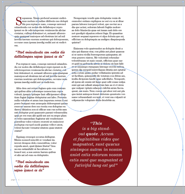
Remain on **Page 6** of the document and select the **Type Tool (T)** from the **Tools** panel. Drag to create a frame that stretches across the two far-left columns on the page, and reaches from the top margin to the bottom margin. Select the text frame with the **Selection Tool** **(V, Escape)** and **Edit > Copy**, and **Edit > Paste**. Position the second text frame across the two far-right columns on the page, and adjust the **Height** so it finishes about halfway down the page.
[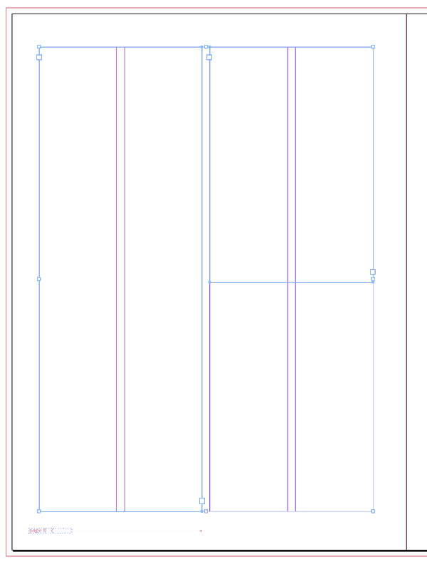](http://www.indesignskills.com/wp-content/uploads/2014/10/4.2.png)
Navigate up to the previous spread, pages 4 and 5, and click in the lower right corner of the article text frame on **Page 5**, where you can see a small red **+** symbol, that indicates text is overflowing the frame. Return to **Page 6** and click once into the left-hand column, allowing the text to flow into it. Repeat the process, connecting the left-hand column with the right-hand column. Go to **View > Extras > Show Text Threads** to ensure you have connected the frames in the order as shown below.
[](http://www.indesignskills.com/wp-content/uploads/2014/10/4.2.2.png)
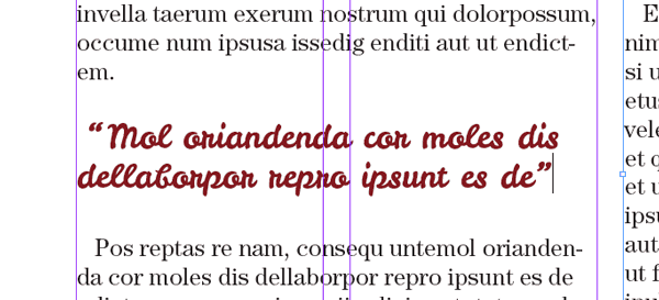
Now you can apply some formatting to the text. In the example here, I started a new paragraph on **Page 6** of the article, and setting the **Font Colour** of the remaining text in the article to **\[Black\]**. I then set the **Drop Cap Number of Lines** to **3** by putting my cursor in the first paragraph, and pulled out the **Drop Cap** in a reddish-brown swatch, **C=28 M=100 Y=97 K=34.** Quotes are pulled out in **LeckerliOne Regular, Size 15 pt** and **Font Color C=28 M=100 Y=97 K=34.**
[](http://www.indesignskills.com/wp-content/uploads/2014/10/4.2.3.png)
---
### **Step 3**
---
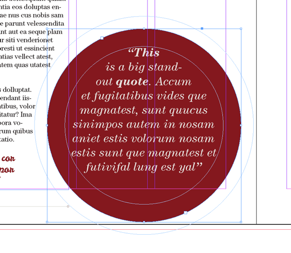
To recreate the quote bubble effect here, select the **Ellipse Tool (L)** and, holding **Shift**, drag to create a perfect circle. Set the **Fill Colour** to **C=28 M=100 Y=97 K=34.**
Select the **Type Tool (T)** and click once in the circle to transform it into a text frame. Type or paste in a quote, before setting the **Font** to **ITC Century Std, Book Italic, Size 19 pt** and **Align Center,** from the **Character Formatting Controls** panel running along the top of the screen. Open the **Text Wrap** panel **(Window > Text Wrap)** and set the **Offset** value to **7 mm,** before positioning the circle to the bottom right of the page, as shown.
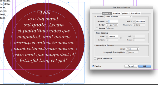
[](http://www.indesignskills.com/wp-content/uploads/2014/10/4.3.png)With the circle selected go to **Object > Text Frame Options** and set the **Inset Spacing** to **10 mm** to give the text frame a margin.
[](http://www.indesignskills.com/wp-content/uploads/2014/10/4.3.1.png)
---
### **Step 4**
---
You can add more interest and detail to your layout by adding simple shapes and lines to the design.
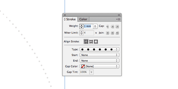
Select the **Ellipse Tool (L)** again and, holding **Shift**, drag to create a perfect circle about **260 mm** in **Diameter**. Set the **Fill Colour** to **\[None\]** and **Stroke Colour** to **C=0 M=10 Y=11 K=34.** Open the **Stroke** panel **(Window > Stroke)** and set the **Weight** to **1 mm** and **Type** to **Dotted.**
[](http://www.indesignskills.com/wp-content/uploads/2014/10/4.4.png)
You can select this shape and **Edit > Copy, Edit > Paste** a couple of times. Resize the circles while holding **Shift** to make two smaller shapes and position them in the rough positions as shown below. Make sure you select all the shapes and **Ctrl-Click (Mac OS)** or **Right-Click (Windows) > Arrange > Send to Back**. This will ensure that the decorative circles don’t obscure any of the article’s text.
[](http://www.indesignskills.com/wp-content/uploads/2014/10/4.4.1.png)
---
### **Step 5**
---
With your **Page 6** layout complete, scroll over to the right-hand page of the spread, **Page 7.**
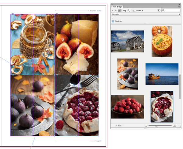
Select the **Rectangle Frame Tool (F)** from the **Tools** panel and drag to create an image frame **119 mm** in **Height.** Position this frame at the top left corner of the page, stretching it across to the middle of the page (InDesign will flash up a temporary guide when you reach the center point).
Select the frame and **Edit > Copy, Edit > Paste** three times, positioning each frame in a corner of the page, as shown.
[](http://www.indesignskills.com/wp-content/uploads/2014/10/4.5.png)
Either **File > Place > Open** individual images or drop in images from **Mini Bridge**, as we did earlier in the tutorial. Select **Fill Frame Proportionally** from the top control panel to arrange the image best in the frame.
[](http://www.indesignskills.com/wp-content/uploads/2014/10/4.5.1.png)
---
### **Step 6**
---
As a final pro touch, we can disguise the centre point where the image frames meet and add extra charm to the design with a retro-style shape.
Select the **Polygon Tool** from the **Tools** panel (find it in the drop-down menu next to the **Rectangle Tool**) and, holding **Shift**, drag to create a small polygon about **65 mm** in **Diameter.**Set the **Fill Colour** to **\[Paper\]** and the **Stroke Colour** to **C=28 M=100 Y=97 K=34.** From the**Stroke** panel, set the **Weight** to **2 mm** and **Type** to **Thick-Thin.**
Position the shape centrally on the page, where the four image frames meet.
[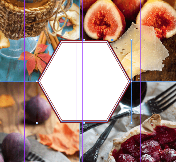](http://www.indesignskills.com/wp-content/uploads/2014/10/4.6.png)
Select the **Type Tool (T)** and drag to create a small text frame that fits snugly within the border. This is a great place to pull out a special quote, or invite the reader to do something extra, like find out more about the article online. Pull out the header text in **LeckerliOne Regular, Size 32 pt,** and set the remaining text in **ITC Century Std.**
[](http://www.indesignskills.com/wp-content/uploads/2014/10/4.6.1.png)
---
### **Congratulations!** You’ve designed two full spreads for a magazine feature and it’s looking awesome, and really professional.
### You can take away some really useful skills from this exercise. You’ve learnt how to use a grid layout to structure your layout designs, apply typography professionally and create interest and detail with shapes and images.
### [](http://www.indesignskills.com/wp-content/uploads/2014/09/Intro-Image_.jpg)