A Basic Grid. by Eric Miller Updated August 29, 2017
The grid system used in the graphic design process is a way of organizing content on a page. It uses any combination of margins, guides, rows, and columns to form a uniform arrangement. It is most apparent in newspaper and magazine layout with columns of text and images, though it can be used in any project.
Grids can be used in almost any type of design project you’re working on.
While periodicals like newspaper and magazines have very apparent grid systems, you will also notice them in brochures, websites, and packaging. Once you learn how to recognize the grid, you will see it everywhere in advertising.
A grid system can be a single grid or a collection of grids. Some are standard to the industry while others are free-form and up to the designer. In a finished product, the grid is invisible, but following it helps in creating successful print and web layouts.
For example, when designing the back of a postcard, you will use the U.S. Post Office’s standard grid. A certain portion of the right side is designated for the addresses and the stamp (or bulk mail) must be in the upper right of this space. You will also need to leave the required ‘white space’ along the bottom where the USPS will place their bar code system. This leaves you with a small section on the left for your design and text.
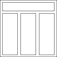
Websites and brochures have a few standard grid systems that designers can use as a base for their own templates. One of the most popular for both projects is the header and three-column layout. This is very familiar to the viewer and can be a quick way to get a jump start on your design.
When designing websites or multi-page print material, you may want to consider having a collection of grids to work with.
Each grid in the collection will be related, but they are also different, which allows you to adapt the information for one page into a more suitable layout without compromising the consistent look and feel required for a great design.
There is really no limit to the grid layouts that can be created. Common types include equally sized two-, three-, and four-column grids with a header across the top, as well as a full-page grid of squares.
From these building blocks, the variation of column widths, borders, page size and other features of the grid will lead to unique page design. When starting a project or even just practicing, try using a grid system to help position the elements of your design on the page.
Once the grid is established, it is up to the designer as to when and how to break out of it. This doesn’t mean the grid will be completely ignored. Instead, elements may cross over from column to column, extend to the end of the page, or extend onto adjacent pages.
Breaking out of the grid can lead to the most interesting page designs. You will see this quite often in modern magazine design.
Miller, Eric. “How to Use the Grid System in Graphic Design.” ThoughtCo, Aug. 29, 2017, thoughtco.com/use-grid-system-in-graphic-design-1697574.
 </div>