The lines that are drawn in equal proportion to each other on a 2-D plane make up the grid system. It is one of the classic tools in design history that have created numerous masterpieces like creative logo designs, graphic posters, websites, and more.
Grids make your design appear appropriate for presentation. More often than not, these help simplify the time-taking process for the design a designer intends to make.

Above, we provided you every detail on how grids operate throughout your design. But even though you know these bring absolute effectiveness to your design, there’s a part of you trying to reason out why you should be using these in the first place.
The grids are known well for bringing order and clarity to your designs so as to improve the overall look and feel. These organize the distribution of content and media across your design platform. Here is an exclusive example of organized content on a grid-based web design prepared by Andrea Scafasci.
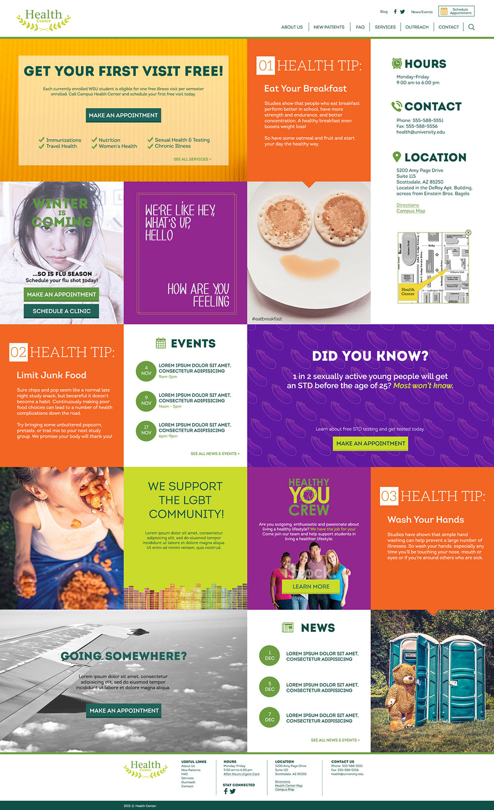
Image Source: Behance/Andrea Scafasci
The lines intersecting at 90° aren’t just a mathematical element, they’re your guide to constructing an impressive cruelty-free design. This gives rise to an organized and aligned state of harmony that becomes highly visible in your design. If you know how to use grids, you can surely employ the best tips and practices for in the easiest way possible.
When we talked about proportion and organization, the balance should be an attribute that naturally becomes a part when you create your own logo. For instance, if you’re employing a grid with 9 equal portions, the content you divide will follow the symmetry in its distribution across the grid allotments.
Image Source: Behance/Katarzyna Mrzyglod
Using a grid is something that actually makes your work faster, easier, and better. Grids help you save time by guiding you to position each type of content in its respective place. It’s more like a natural time-saving solution for most of your design problems.
Once the grid foundation is laid (based on how you want your overall design to look like), other steps for design preparation become easy to handle.
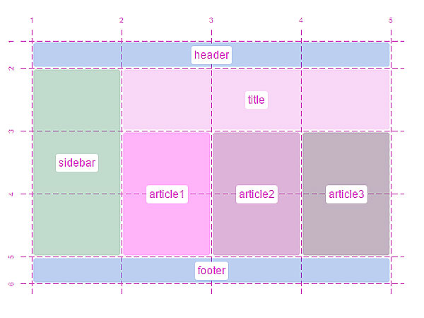
Image Source: Mozilla Hacks
When it comes to clearing the design clutter, no one does it better than grids. But to free some space, you need to make sure that the grid you’re using is the right one for your project.
If you’ve gone through the components of a grid, you must’ve noticed that there are margins and gutters that are equally important as your lines. If the margins become tighter and the gutters become congested, the elements of your design will present a tensed and packed image that won’t look that pleasing. On the opposite, keeping your margins open and your gutters spacious will make your design neater and cleaner.
Image Source: Prototypr
Regardless of the media you’re constructing a grid for, it leverages you the advantage to apply the same grid for the layout of multiple pages of your design project.
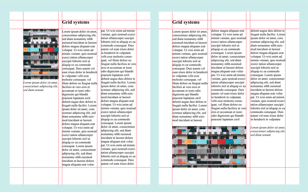
Image Source: blog.visme.co
The example above is a simple yet transparent example of how a single grid can be used for the layout of multiple pages, yet add some element of change.
Check out the infographic below to discover how you can use grids to make impressive logos.

A grid will promise you a pristine look and concordance between your design elements. What more you could do is just break the grid. Well, of course, you made the grid because you wanted a clutter-free design that gives your eyes a soothing sensation.
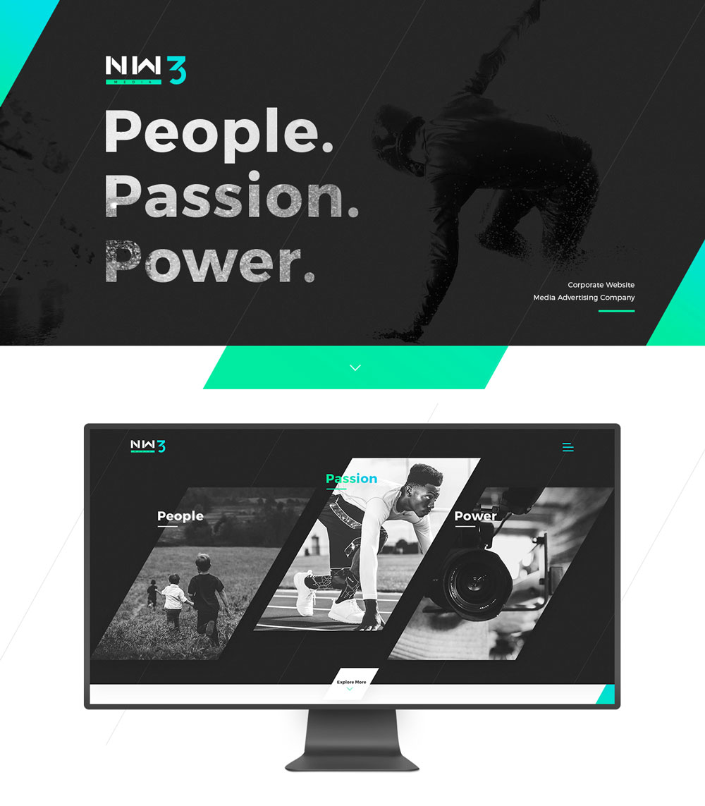
Image Source: Behance/Viacheslav Olianishyn
Since grids control a lot of things, their main purpose is to beautify your design layout. There are many ways of how you can use grids – either horizontal, vertical, or diagonal – such as the golden ratio and the rule of thirds.
The golden ratio is based on the mathematical ratio (1.618) that promises the distribution of lines in a symmetrical and proportionate manner. It is usually used as a part of the grid system to develop awe-inspiring logo designs. The rule of third deals with parting your grid in three equal sections, allowing you to construct sections that are multiples of 3, such as 3, 9, 12, and so on. The rule of thirds is mostly used by photographers to create stunning designs using their work.
There is a common misconception regarding grids. It’s been thought that by using a grid, you’re only limited to a certain number of equal sections and that you’re stuck with that rigid frame. Believe me, a grid’s much more than that.
Grids also promise visual hierarchy. There are many examples of how you can improve the way your design looks. One of these examples is Curioos, where the grid is divided into many sections. A bigger section is used to emphasize the call to action, while the two-columned grid is used for product display.
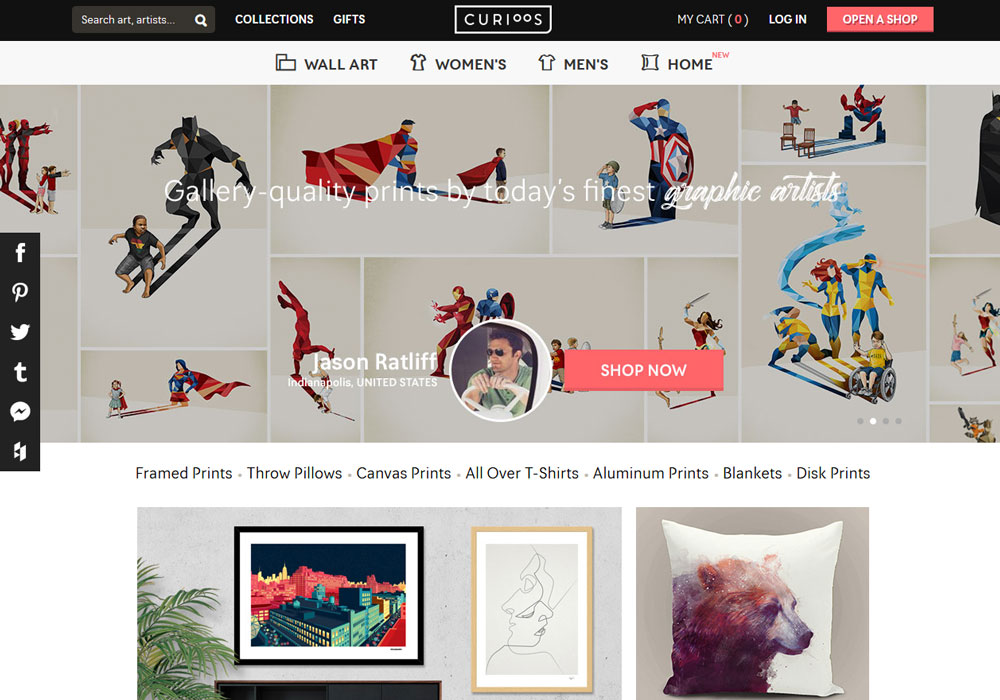
Image Source: Curioos
Not only does a design layout look greater in digital media, but it also looks marvelous in print as well.
Grids don’t limit you. They add flexibility to your design and adapt to your design requirements. When you’re choosing a grid, you must also think in terms of coming up with an interesting and appealing design that can adapt to all media platforms.
You can use multi-columned grids that can exceed up to 13 columns for a single layout. From using the simplest grids to making use of multiple innovative grid ideas, designers can keep using flexible ways, so they can contribute to the elasticity of the grid system.
When using grids, it is noticed that the importance of spacing is often neglected and the design ends up being all tensed and suffocated. Since modern design deems it necessary to add more of that white space, grids naturally become helpers with that as well.
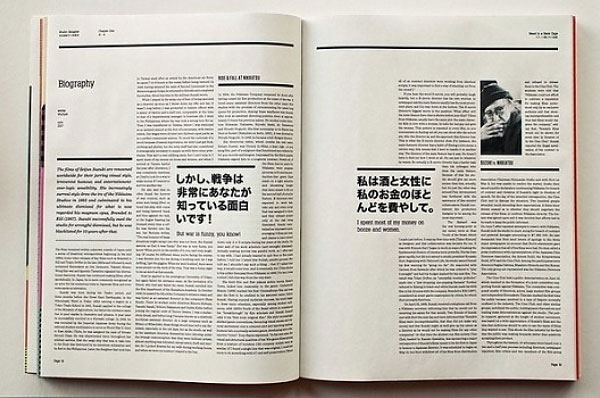
Image Source: Designspiration
When you’ve divided your design base into desired columns, you can keep some of the vertical or horizontal sections empty and just let them be.
Regardless of the area where you place your header, as long as it’s contained within one section, it will help your readers direct their attention to where the header points to.
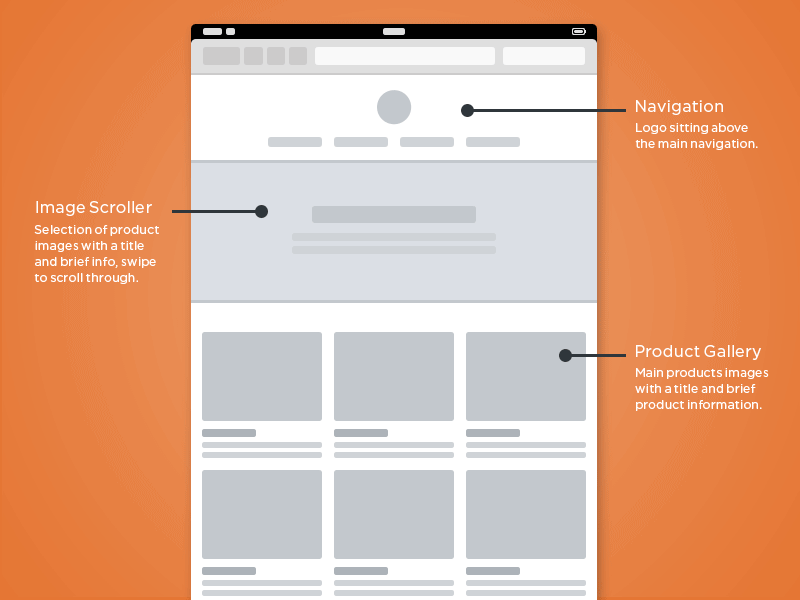
Image Source: Dribbble/Chris Bannister
It helps your readers make sense of the elements of your design on display. If the type you’re using is small and congested, don’t hold your breath for your audience to zoom in and read that minute text. If you’re using headers for some important news or announcement, you’ll probably want to grab your viewer’s attention, which is why simpler, bigger, and readable text is better.
You see, your grid also helps the content in such a way that it easily navigates your viewer’s eyes. It smoothens the user experience when your audience knows where they have to go and what they have to do next.