Source: https://tobiasahlin.com/blog/common-flexbox-patterns
In theory, using flexbox (Flexible Box Module) to build complex layouts is pretty straightforward. Still, they have often found themselves adding display: flex to an element and spending an eternity trying to figure out how to make anything behave as expected. If you’re anything like them, here’s a list of 10 example flexbox layouts with CSS that you can copy and paste to get started with your layouts. They will walk through these basic layout patterns (click to jump to an example).
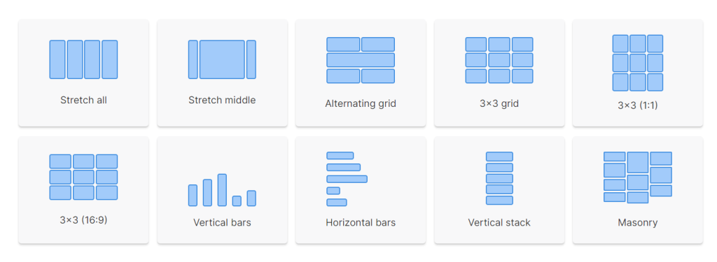 Every example assumes that your HTML contains an element with a class of
 container , which then contains several children that all have a class of item (the number of children varies per example):
<div class="container">
  <div class="item"></div>
  <div class="item"></div>
  <div class="item"></div>
  ...
</div>
 See the Pen Stretch all fixed spacing: Flexbox by Nicholas D’Angelo (@ndangelo) on CodePen.
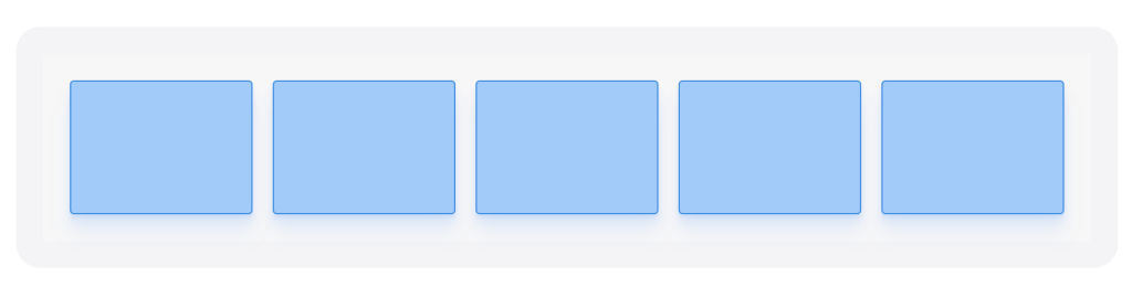
The most basic flexbox pattern is getting a few boxes to stretch and fill the full width of their parent element. All you need to do is to set display: flex on the container, and a flex-grow value above 0 on the children:
.container {
  display: flex;
}

.item {
  flex-grow: 1;
  height: 100px;
}

.item + .item {
  margin-left: 2%;
}
We use a + selector to only add gaps between pairs of items (essentially just skipping the left margin for the first item in the list).
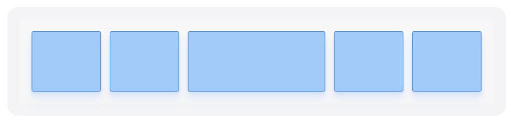
Increasing flex-grow will increase the amount of space that an element is allowed to stretch to compared to any other element. If we set flex-growto 2 on the middle element here, we would basically divide up the available space into 6 chunks (1 chunk for each item plus 1 extra for the middle item, 1+1+2+1+1). The middle item gets two chunks (flex-grow: 2) worth of space, and all other elements get one chunk (flex-grow: 1).
 See the Pen Stretch all fixed spacing: Flexbox by Nicholas D’Angelo (@ndangelo) on CodePen.
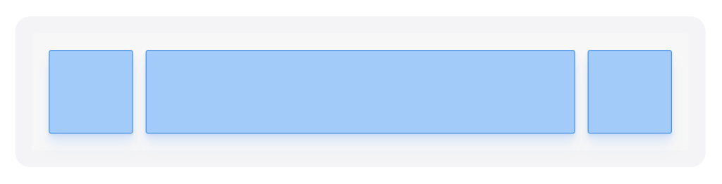
A common app and web pattern is to create a top bar where we want to stretch only the middle element, but keep the right most and left most elements fixed. If we just want one element to stretch, we can set a fixed width (e.g. 100px) on an element that should stay static, and flex-grow: 1 on the element that should stretch:
.container {
  display: flex;
}

.item {
  height: 100px;
  width: 100px; <em>/* A fixed width as the default */</em>
}

.item-center {
  flex-grow: 1; <em>/* Set the middle element to grow and stretch */</em>
}

.item + .item {
  margin-left: 2%;
}
Even if the middle element here has a defined width of 100px, flex-grow will make it stretch to take up all the available space.
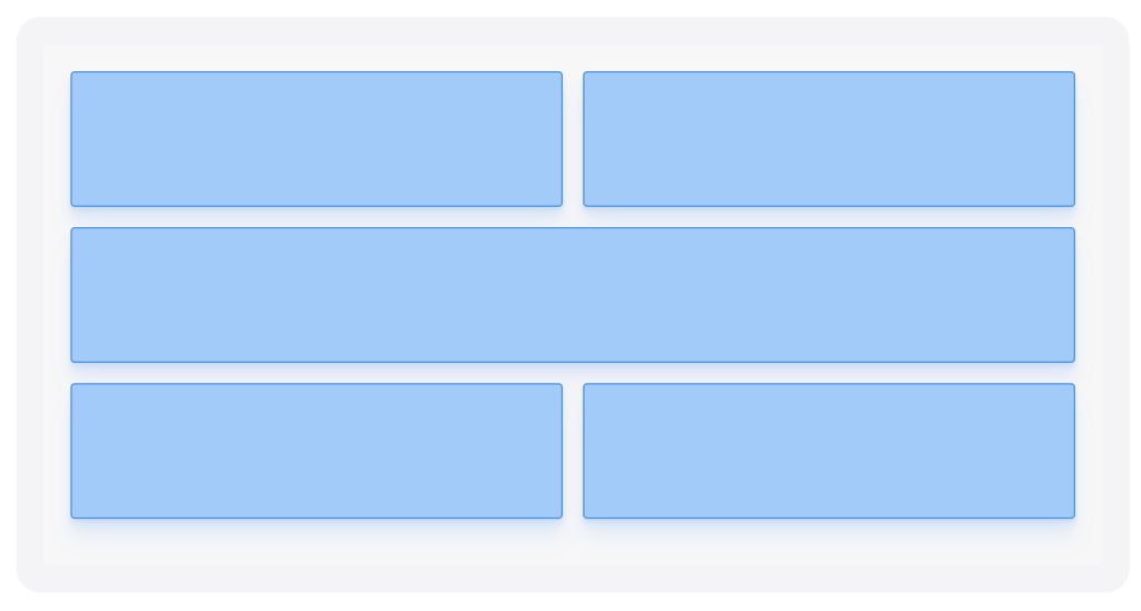 This layout pattern is used on the following site https://tobiasahlin.com/blog/ The goal is to create a grid with some variation: after every row of two equally sized items there’s one item that takes up an entire row:
To accomplish this we need to:
flex-wrap: wrap on the container (or all items would be rendered on a single row)justify-content: space-between on the container, to only create space between the elements (and not between the edge of the parent element and items)width to 49% (or something similar that is equal to or less than 50%)width to 100% so that it fills that entire row. We can target every third item in the list with the nth-child() selector..container {
display: flex;
flex-wrap: wrap;
justify-content: space-between;
}
.item {
width: 48%;
height: 100px;
margin-bottom: 2%;
}
.item:nth-child(3n) {
width: 100%;
}
If you want the first row to be full-width and the two following items to share a row, note that you can’t write .item:nth-child(1n) { width: 100% }—that would target all items. You have to target the first item by selecting every third element, and then stepping back two items: .item:nth-child(3n-2) { width: 100% }.
See the Pen Stretch middle, fixed spacing: Flexbox by Nicholas D’Angelo (@ndangelo) on CodePen.
 See the Pen Alternating grid: Flexbox by Nicholas D’Angelo (@ndangelo) on CodePen.
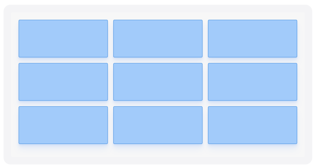
We can create a 3×3 grid by setting flex-grow to 0 and flex-basis to the preferred width for all children (here done using the flex short-hand: flex: 0 32%). The margins between the items are the leftovers from every row, i.e. (100%-32×3)/2=2%. I’ve matched the margin (margin-bottom: 2%) to achieve even spacing between all elements:
.container {
  display: flex;
  flex-wrap: wrap;
  justify-content: space-between;
}

.item {
  flex: 0 32%;
  height: 100px;
  margin-bottom: 2%; <em>/* (100-32*3)/2 */</em>
}
You can change the flex-basis to increase or decrease the number of items on each row. flex: 0 24% would put 4 items on every row, flex: 0 19% would put 5 items on every row, and so on so forth.
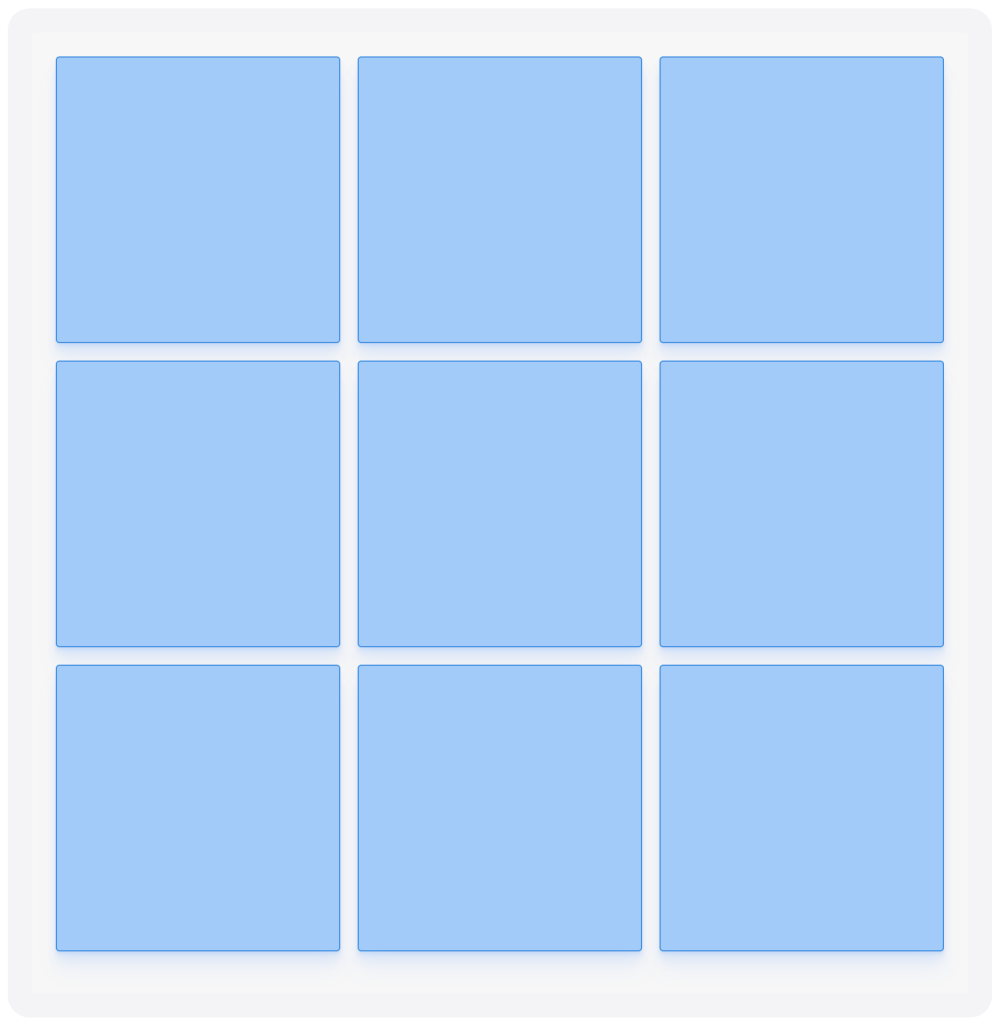
Using a somewhat hacky CSS trick, we can create a grid full of items with constrained proportions. If we use padding-bottom when setting width on an element, the width is set relative to that item’s parent’s width. We can use that effect to create a square by setting an item’s padding-bottom and width to the same value (and effectively setting the height of that element through padding).
.container {
  display: flex;
  flex-wrap: wrap;
  justify-content: space-between;
}

.item {
  width: 32%;
  padding-bottom: 32%; <em>/* Same as width, sets height */</em>
  margin-bottom: 2%; <em>/* (100-32*3)/2 */</em>
  position: relative;
}
Since we’ve created an element that is effectively made up of only padding, and there’s no place left for content, we need to set position: relative on the .item in this example and add a child element with position: absolute, and use that element to “reset” the canvas and add content.
 See the Pen 3×3 Grid: Flexbox by Nicholas D’Angelo (@ndangelo) on CodePen.
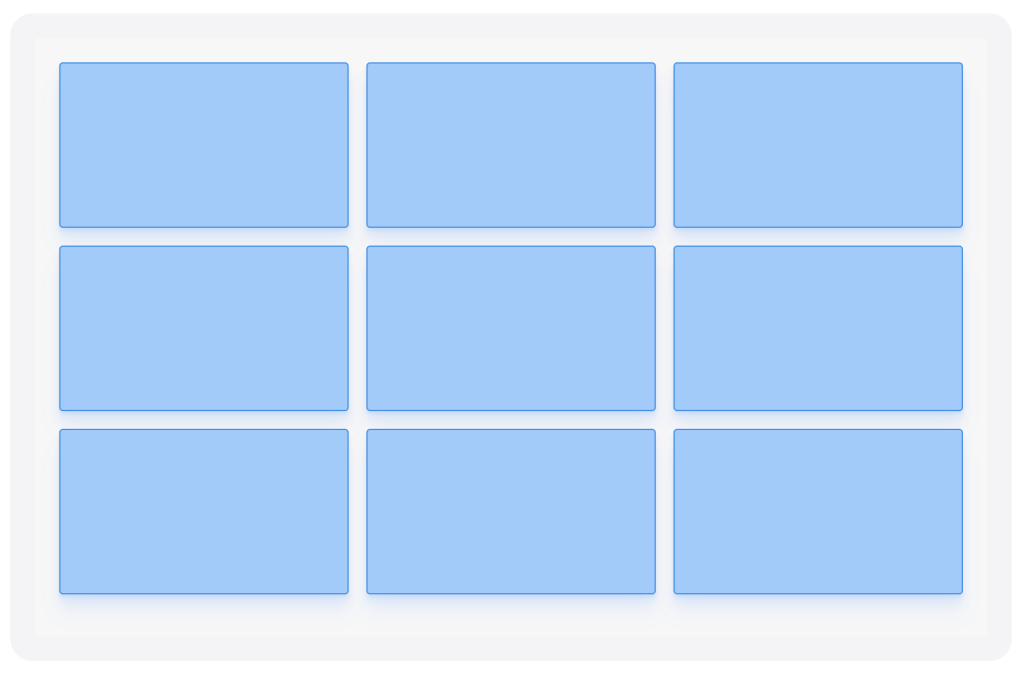
To change the proportions of the items all you need to do is change the proportions of the width and padding-bottom on the .item. Changing the width would affect the number of items on each row, so as to not affect the grid structure we can for example change padding-bottom to 18% to create 16:9 (equivalent to 32:18) rectangles.
.container {
  display: flex;
  flex-wrap: wrap;
  justify-content: space-between;
}

.item {
  width: 32%;
  padding-bottom: 18%; <em>/* 32:18, i.e. 16:9 */</em>
  margin-bottom: 2%; <em>/* (100-32*3)/2 */</em>
}
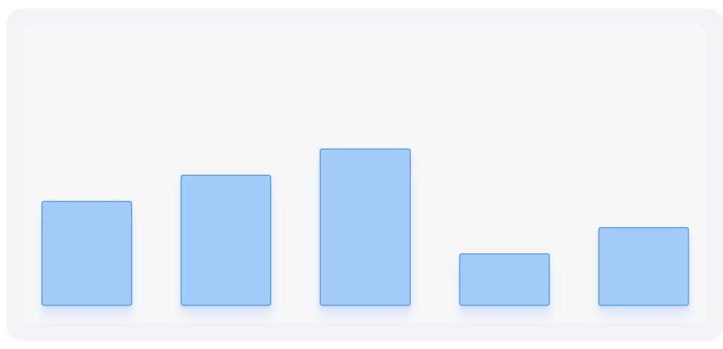
If you want to use Flexbox to create a simple graph visualization, all you need to do is to set align-items of the container to flex-end and define a height for each bar. flex-end will ensure that the bars are anchored to the bottom of the graph.
.container {
  display: flex;
  height: 300px;
  justify-content: space-between;
  align-items: flex-end;
}

.item { width: 14%; }
.item-1 { height: 40%; }
.item-2 { height: 50%; }
.item-3 { height: 60%; }
.item-4 { height: 20%; }
.item-5 { height: 30%; }
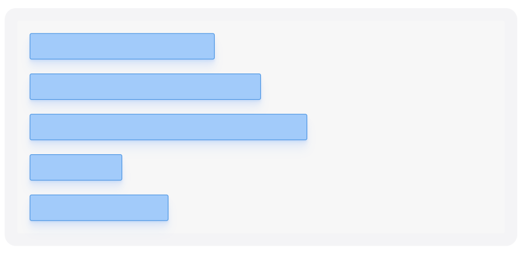 Using the same technique as for vertical bars, one can add on the with a value of to create a set of horizontal bars. can have a value of (default) or , where runs horizontally (→) and runs vertically (↓). One can also reverse the direction of both by using (←) and (↑), respectively.
.container {
  display: flex;
  height: 300px;
  justify-content: space-between;
  flex-direction: column;
}

.item { height: 14%; }
.item-1 { width: 40%; }
.item-2 { width: 50%; }
.item-3 { width: 60%; }
.item-4 { width: 20%; }
.item-5 { width: 30%; }
 See the Pen 3×3 grid, constrained proportions (16:9): Flexbox by Nicholas D’Angelo (@ndangelo) on CodePen.
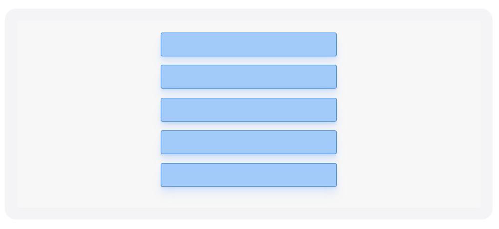
To create a vertical stack and make the items run from top to bottom all we need to do is to change the flex-direction from the default value of row to column:
.container {
  display: flex;
  flex-direction: column;
  align-items: center;
}

.item {
  height: 40px;
  margin-bottom: 10px;
}
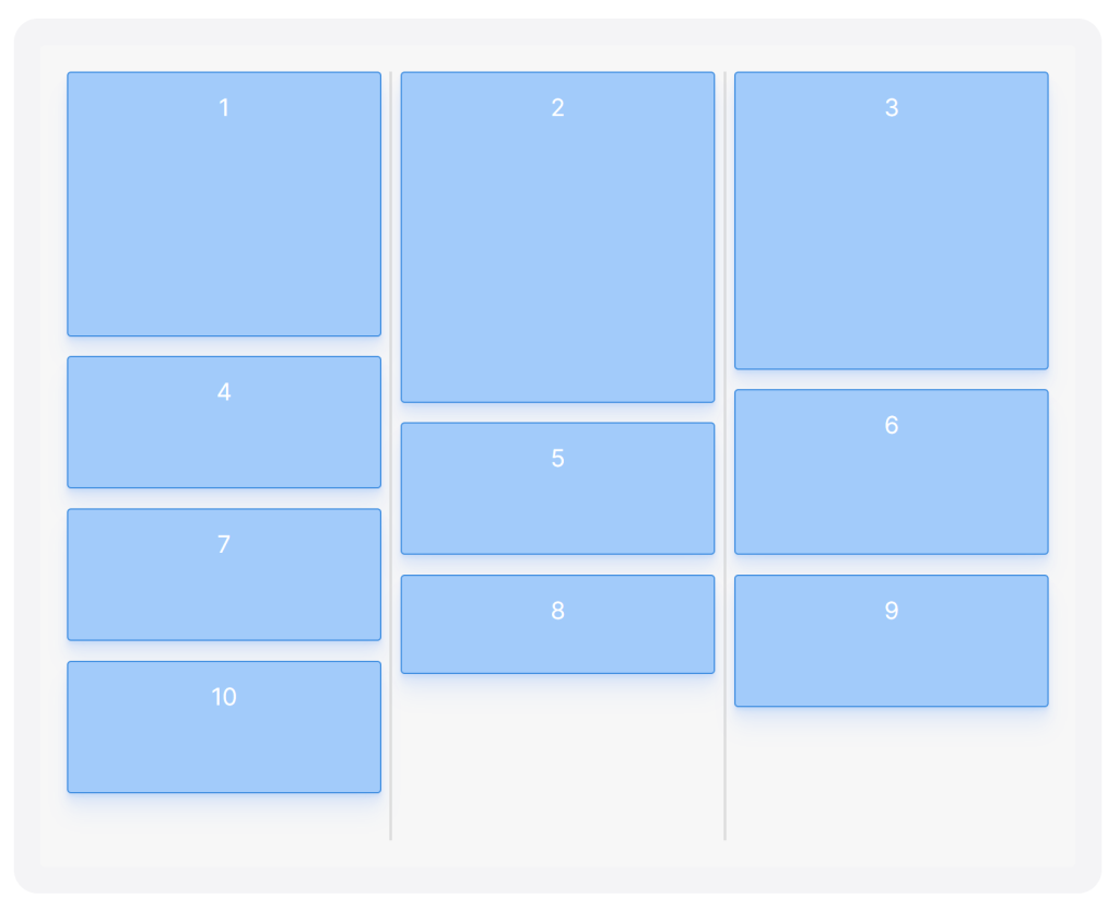 You’ve probably seen masonry (or mosaic) layouts all over the internet, but it’s likely that they were all powered by Masonry or a similar JavaScript library. Flexbox might seem like a great candidate to create this layout with CSS only finally, and it’s certainly possible, but it’s surprisingly hacky.
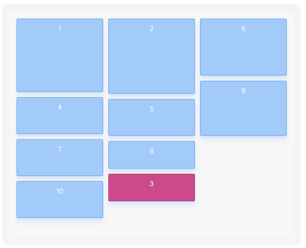
One of the main challenges of creating a masonry layout with flexbox is that to make an item affect the positioning of an item above and below it we need to change the flex-direction of the container to column, which makes items run from top to bottom. This creates a layout that looks great, and similar to the masonry effect, but it could be confusing for users; it creates an unexpected ordering of elements. If you read from left to right the elements would seem to be shuffled and appear in a seemingly random order, for example 1, 3, 6, 2, 4, 7, 8, etc.
Luckily, we can use the order property to change in which order elements are rendered. We can combine that property with some clever use of the nth-child() selector to order items dynamically depending on their original order. If we want to create a masonry layout with three columns we can divide all the items into three “groups”, like so:
<em>/* Re-order items into rows */</em>
.item:nth-child(3n+1) { order: 1; }
.item:nth-child(3n+2) { order: 2; }
.item:nth-child(3n)   { order: 3; }

<em>/* Force new columns */</em>
.container::before,
.container::after {
  content: "";
  flex-basis: 100%;
  width: 0;
  order: 2;
}
I’ve written another post that explains in detail how this works and why. This will set the order to 1 for the 1st element, 4th element, 7th element, etc. Elements with the same order value will be ordered on ascending order according to the source code order, or which value was set first, so in this example we’re producing three sets ordered like so: 1, 4, 7, 10 (3n+1) with order: 1, 2, 5, 8 (3n+2) with order: 2, and 3, 6, 9 (3n) with order: 3. These three groups represent our three columns. Put together the order becomes 1, 4, 7, 10, 2, 5, 8, 3, 6, 9.
If we make sure to render each of those groups as one column (no more, no less), it’ll create the illusion that the items have returned to their original order when you read from left to right. If we visually parse the grid as rows, the first row will contain the first element from every group (1, 2, 3), the second row will contain the second element from every group (4, 5, 6), and so on so forth. We then insert elements between the columns that take up 100% of the parent’s height, which force the columns to line break and not accidentally merge with adjacent columns. Here’s the full CSS snippet:
.container {
  display: flex;
  flex-flow: column wrap;
  align-content: space-between;
  height: 580px;
}

.item {
  width: 32%;
  margin-bottom: 2%; <em>/* (100-32*3)/2 */</em>
}

<em>/* Re-order items into rows */</em>
.item:nth-child(3n+1) { order: 1; }
.item:nth-child(3n+2) { order: 2; }
.item:nth-child(3n)   { order: 3; }

<em>/* Force new columns */</em>
.container::before,
.container::after {
  content: "";
  flex-basis: 100%;
  width: 0;
  order: 2;
}
Visually this achieves something that is very close to the masonry effect. How is the tab order affected? Luckily, not at all. order only changes the visual representation of objects, not the tab order, so tabbing through the grid will work as intended.
If you want to make a masonry layout with more than three columns (or want a better understanding of how this works) I recommend reading the dedicated post on how to create masonry layouts with CSS.
Source: https://tobiasahlin.com/blog/masonry-with-css/
On the surface it seems fairly easy to create a masonry layout with flexbox; all you need to do is set flex-flow to column wrap and voilà, you have a masonry layout. Sort of. The problem with this approach is that it produces a grid with a seemingly shuffled and obscure order. Items will be (unbeknownst to the user) rendered from top to bottom and someone parsing the grid from left to right will read the boxes in a somewhat arbitrary order, for example 1, 3, 6, 2, 4, 7, 8, 5, and so on so forth.
Flexbox has no easy way of rendering items with a column layout while using a row order, but we can build a masonry layout with CSS only—no JavaScript needed—by using :nth-child() and the order property. In a gist, here’s the trick to create a row order while using flex-direction: column, given that you’re rendering three columns:
<em>/* Render items as columns */</em>
.container {
  display: flex;
  flex-flow: column wrap;
}

<em>/* Re-order items into rows */</em>
.item:nth-child(3n+1) { order: 1; }
.item:nth-child(3n+2) { order: 2; }
.item:nth-child(3n)   { order: 3; }

<em>/* Force new columns */</em>
.container::before,
.container::after {
  content: "";
  flex-basis: 100%;
  width: 0;
  order: 2;
}
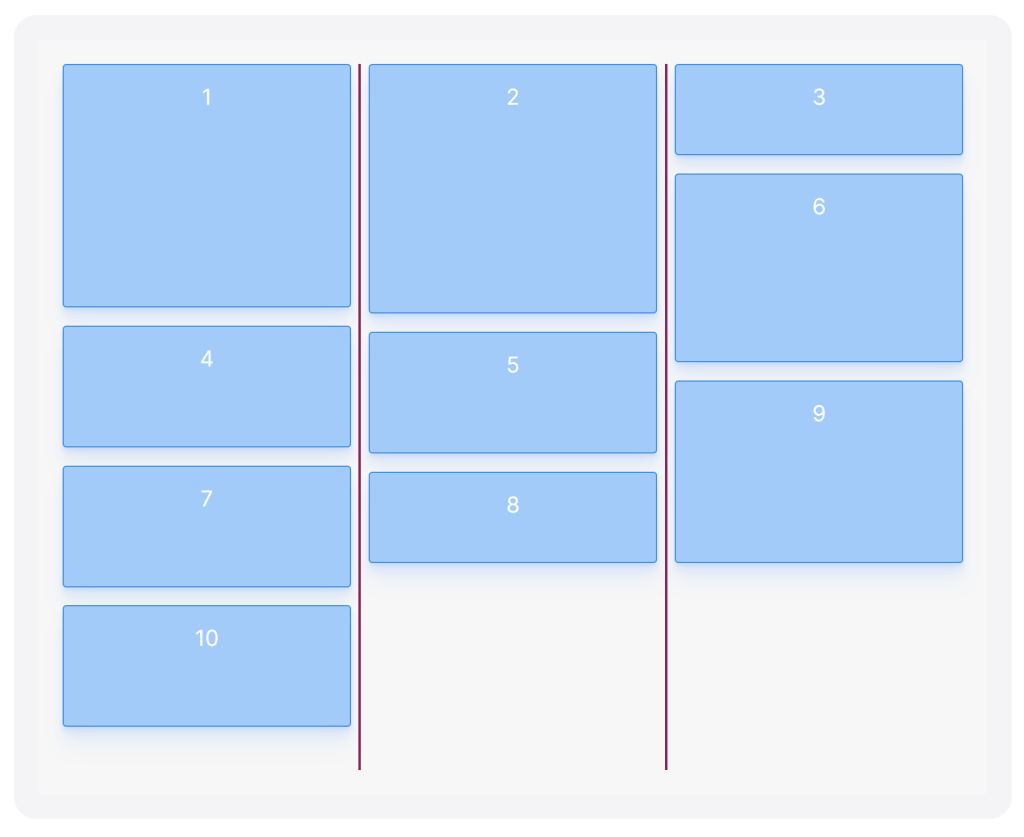
This will create a masonry layout with items rendered as columns but ordered as rows (the gray vertical lines represent the pseudo elements that force line breaks:
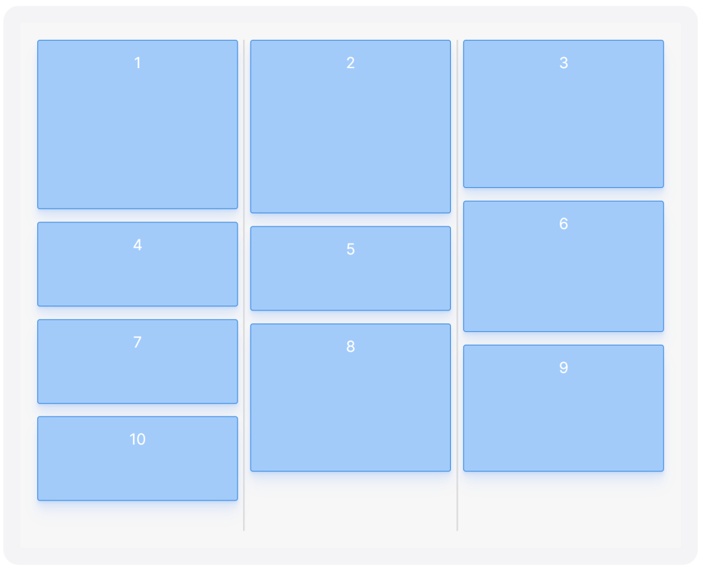
Let’s break down the implementation (or jump to the solution, or see the codepen collection).
Flexbox is not built for masonry—if you set a fixed height on a flex container (so that items can wrap when they overflow) and flex-flow to column wrap, you’ll achieve something like this:
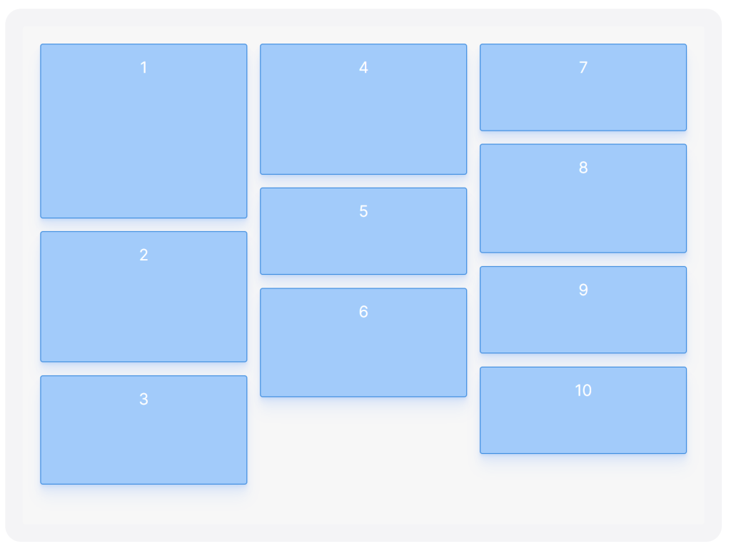 Items are rendered in columns from top to bottom, producing an arbitrary order when read from left to right. This is the expected outcome and desirable in many scenarios, but not when we’re trying to create a masonry layout, and it becomes increasingly disorienting as a page grows taller.
If we instead change the flex-direction to row and have elements of varying heights we’ll achieve the correct order but with weird and unexpected gaps all over our grid:
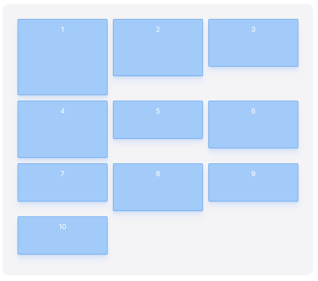 So it seems impossible to get the best of both worlds: items rendered as columns but ordered as rows. You might decide to use
 flex-direction: column You can move around the elements in your HTML to achieve the right visual order, but this can be cumbersome and unnecessarily complex and can mess up the tab order of the elements.
order and nth-child()The order property affects the order of items contained in a CSS flexbox or grid, and we can use it to re-order items for our soon-to-be masonry layout. The order property is pretty straight-forward to use: if you have two elements and one has order: 1 and the other one has order: 2 the element with order: 1 will be rendered before the other element, independent of their HTML source code order.
The CSS masonry solution depends on a detail of the order specification: what happens if two or more elements have the same order value? Which comes first? Flexbox falls back on the source code order: the element that appears first in the source code will be rendered before other elements with the same order value. This fact gives us the possibility to easily re-group items in our grid so that we can change the ordering from columns to rows, while still rendering those rows as columns, using nth-child().
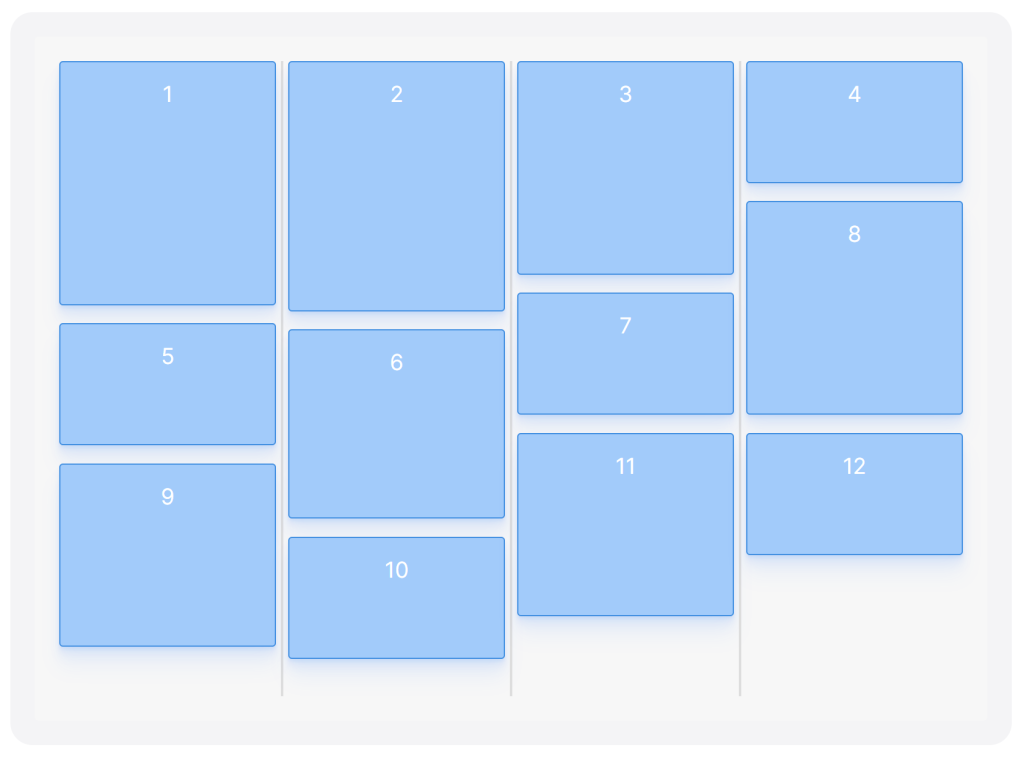
Look at the table below. To achieve a sensible order using flex-direction: row we’d just have to render elements in the default order: 1, 2, 3, 4, 5, 6 , etc.
| Column 1 | Column 2 | Column 3 | |
|---|---|---|---|
| Row 1 | 1 | 2 | 3 |
| Row 2 | 4 | 5 | 6 |
| Row 3 | 7 | 8 | 9 |
| Row 4 | 10 | 11 | 12 |
If we want to achieve the same order while using flex-direction: column we need to change the order of the elements to match the order of each column in the table (rather than each row):
| Column 1 | Column 2 | Column 3 | |
|---|---|---|---|
| Row 1 | 1 | 2 | 3 |
| Row 2 | 4 | 5 | 6 |
| Row 3 | 7 | 8 | 9 |
| Row 4 | 10 | 11 | 12 |
I.e. the first elements in our flexbox layout have to be 1, 4, 7, 10. These items will fill up the first column, followed by 2, 5, 8, 11 for the 2nd column and 3, 6, 9, 12 for the 3rd and last column. This is where the nth-child() selector comes in. We can use it to select every third element (3n), starting with the first element (3n+1), and set all those elements to have the same order value:
.item:nth-child(3n+1) { order: 1; }
This selector sets order: 1 for element 1, 4, 7, 10 in our container, i.e. the entire first column. In other words we’re using a combination of nth-child() and order to re-order items depending on their original order. To create the 2nd and 3rd column we change the offset:
.item:nth-child(3n+1) { order: 1; }
.item:nth-child(3n+2) { order: 2; }
.item:nth-child(3n)   { order: 3; }
Here we’re producing three sets: 1, 4, 7, 10 (3n+1) with order: 1, 2, 5, 8, 11 (3n+2) with order: 2, and 3, 6, 9, 12 (3n) with order: 3. All together the order becomes 1, 4, 7, 10, 2, 5, 8, 11, 3, 6, 9, 12.
If we render each of those groups as one column (and no more), it’ll create the illusion that the items have returned to their original order when you read from left to right. If we visually parse the grid as rows, the first row will contain the first element from every group (1, 2, 3), the second row will contain the second element from every group (4, 5, 6), and so on so forth. This technique allows us to create a masonry layout with items rendered as columns but ordered as rows.
 How is the tab order affected by shuffling around elements like this? Luckily, not at all.
 order Tabbing through the grid will work as intended, as the change only affects the visual representation of objects, not the tab order.
If you have many items in a masonry layout this technique will fairly certainly break down at some point. We’re counting on that every “group” we’ve created will be rendered as exactly one column, but in reality, items can have different heights, and columns can easily start to merge. The first column could be longer than the other two, for example, which could make the third column start at the end of the second column:
 The highlighted box here (3) has to be rendered at the start of the third column or the ordering algorithm will break, but if there’s space for another element at the end of the 2nd column it will naturally be rendered there.
We can fix this wrapping issue by forcing columns to restart at certain points. There’s no easy way of saying “this element should line break” with flexbox, but we can achieve this effect by adding invisible elements that take up 100% of the container’s height. As they require 100% of the parent’s height to be rendered they won’t fit in a column together with any other element, so they’ll essentially force line breaks by creating collapsed columns.
We have to insert these line break elements into our grid and array of elements, so what we’re looking for is to create this sequence of elements: 1, 4, 7, 10, <break>, 2, 5, 8, 11, <break>, 3, 6, 9, 12. We can use pseudo-elements on the container to add these, and we can set the order to 2 on both of them. Adding a pseudo-element with :before will make it the first child of the container and adding a pseudo-element with :after will make it the last child of the container, so if we set order: 2 on both of them they will become the first and the last element of the order: 2 “group” (as they appear before and after the other elements): :before, 2, 5, 8, 11, :after.
<em>/* Force new columns */</em>
.container::before,
.container::after {
  content: "";
  flex-basis: 100%;
  width: 0;
  order: 2;
}
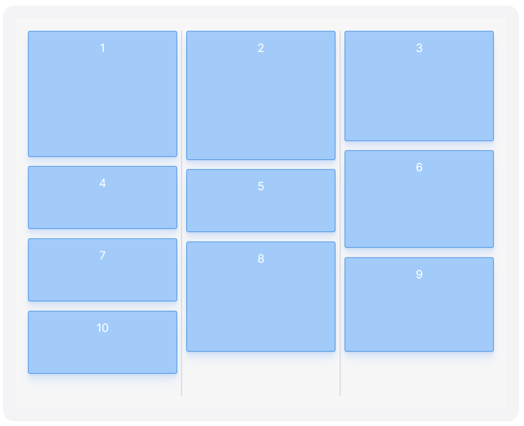
I’ve highlighted the pseudo-elements below to show their effect. Notice that despite that box 3 would fit in the 2nd column it’s rendered as the first element in the last column:
As a final step, you need to make sure that your flex container has a set height that makes it taller than your tallest column (so that all columns will fit). Put together, this will produce a CSS masonry layout with three columns (also available as a codepen):
See the Pen CSS flexbox masonry, 3 columns by Tobias Ahlin (@tobiasahlin) on CodePen.
.container {
  display: flex;
  flex-flow: column wrap;
  align-content: space-between;
  <em>/* Your container needs a fixed height, and it
   * needs to be taller than your tallest column. */</em>
  height: 600px;
}

.item {
  width: 32%;
  margin-bottom: 2%; <em>/* Optional */</em>
}

<em>/* Re-order items into 3 rows */</em>
.item:nth-child(3n+1) { order: 1; }
.item:nth-child(3n+2) { order: 2; }
.item:nth-child(3n)   { order: 3; }

<em>/* Force new columns */</em>
.container::before,
.container::after {
  content: "";
  flex-basis: 100%;
  width: 0;
  order: 2;
}
Your HTML should look like this, with one <div /> for every item in your grid:
<div class="container">
  <div class="item"></div>
  <div class="item"></div>
  <div class="item"></div>
  ...
</div>
To create a masonry layout with more than three columns, we need to adapt our sorting algorithm, update the width of the items, and insert line break elements manually (instead of using pseudo-elements). For quick access to the final result, I’ve compiled a list of code pens showcasing flexbox masonry with 3, 4, 5, and 6 columns.
Since we’re limited to creating just two pseudo-elements with :before and :after we need to manually add break elements into our container (you need one less break element than the number of columns in your layout). You can append them to the end of your container, they’ll be sorted into their respective columns:
<div class="container">
  <div class="item"></div>
  <div class="item"></div>
  <div class="item"></div>
  <div class="item"></div>
  ...
  <span class="item break"></span>
  <span class="item break"></span>
  <span class="item break"></span>
</div>
We’re inserting column breaks as spans in order to sort them independently from the content items. We need a way to “restart” the counting once we reach the break elements, or an uneven number of content items could make the first break element start after the 3rd column, for example. The :nth-of-type selector targets elements of different types independently, so we can decouple the order of the content items and the column breaks like so:
.item:nth-of-type(4n+1) { order: 1; }
.item:nth-of-type(4n+2) { order: 2; }
.item:nth-of-type(4n+3) { order: 3; }
.item:nth-of-type(4n)   { order: 4; }
The break elements, like previously, take up the full height of the container:
<em>/* Force new columns */</em>
.break {
  flex-basis: 100%;
  width: 0;
  margin: 0;
}
This will create a masonry layout with four columns (view codepen):
 See the Pen CSS flexbox masonry, 4 columns by Tobias Ahlin (@tobiasahlin) on CodePen.
Here’s the full solution for a CSS masonry layout with four columns:
.container {
  display: flex;
  flex-flow: column wrap;
  align-content: space-between;
  <em>/* Your container needs a fixed height, and it
   * needs to be taller than your tallest column. */</em>
  height: 600px;
}

.item {
  width:24%;
  margin-bottom: 2%; <em>/* Optional */</em>
}

<em>/* Re-order items into 4 rows */</em>
.item:nth-of-type(4n+1) { order: 1; }
.item:nth-of-type(4n+2) { order: 2; }
.item:nth-of-type(4n+3) { order: 3; }
.item:nth-of-type(4n)   { order: 4; }

<em>/* Force new columns */</em>
.break {
  flex-basis: 100%;
  width: 0;
  margin: 0;
}
This CSS-only way of creating a masonry (or mosaic) layout is surely not as robust, flexible, and foolproof as a JavaScript implementation (like Masonry) but if you don’t want to rely on a third-party library just to create a masonry layout I hope that these layouts tricks can come in handy.
For help with more common CSS flexbox patterns, I’ve compiled a list of flexbox examples that you can copy and paste into your projects and written in-depth about the line-breaking flexbox item technique.