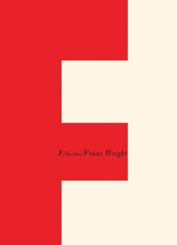
 If there’s one thing we learned from the Bauhaus (the pioneers of Modernist design), it’s that being bold pays off.
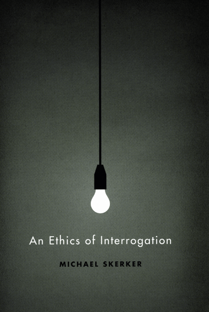
Drawing attention to one element cutting through space generates a fantastic sensory reaction from the viewer. It sends one’s imagination into overdrive. With this cover, you can almost hear the clicking on of the light bulb and the metal chairs dragging across the floor beneath it. Almost feel the coldness of the concrete room in your fingertips. It begs for the camera to pan down and reveal the scene below. It’s exciting!
Bonus points for the double meaning of “shedding a light on the ethics of interrogation practices”, and for making us feel like we’ll be in on a secret.
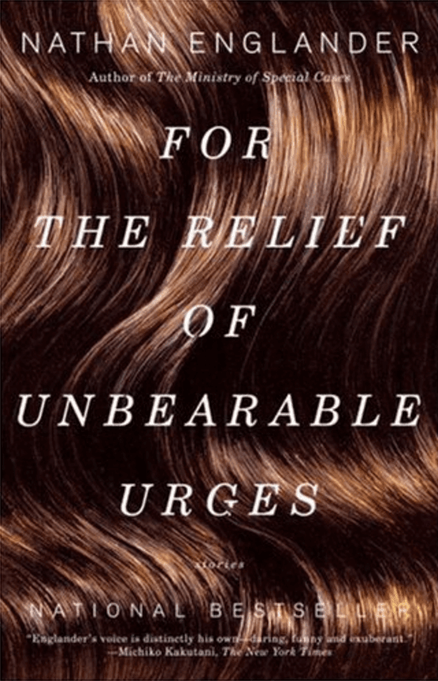
This cover takes that sensory experience one step further by depicting a simple close-up on a texture. Such imagery sends strong messages from our sense memory to our tingling hands. This sort of experiential reaction can only be a good thing when enticing new readers to your book.
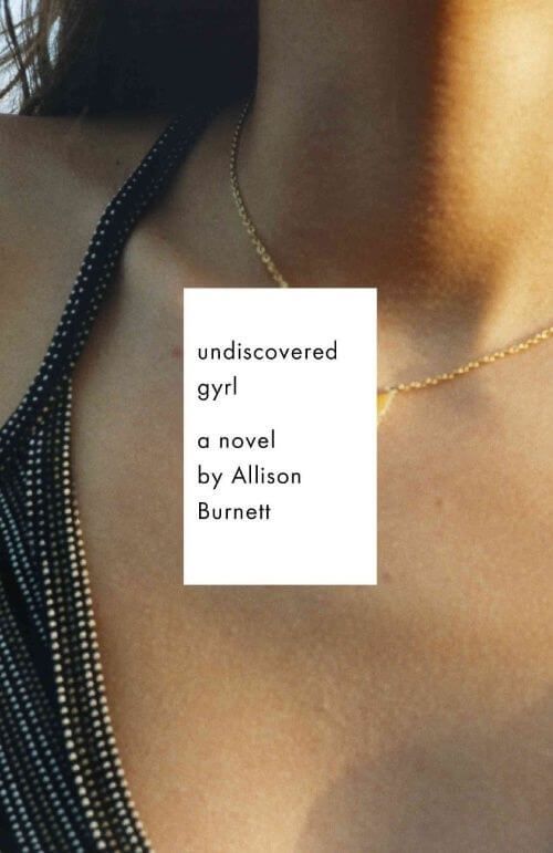
When generating intrigue, the trick is not to give away too much. This cover photo has been cropped in such a masterful way as to give the viewer a strong sense of what they’re looking at while teasing at the missing details.
Her necklace charm, the only item that should give us a clue about the girl in the picture, has been completely obscured by the text box. The viewer wants to see more, to learn more.

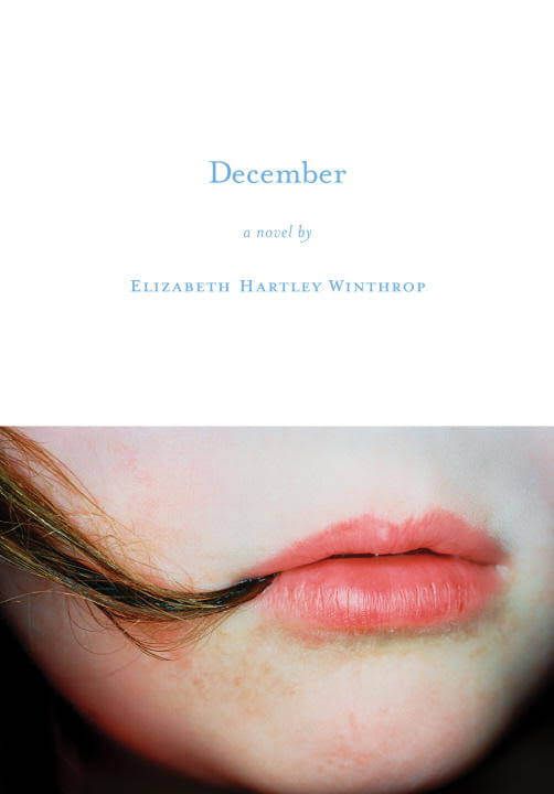
December
This cover is the inverse concept of the above “Crop”. Rather than questioning what might be outside the frame, it encourages us to study the details of what we’ve been given. These details provide clues about the person, in this case, who’s life we might learn about in the book. Perhaps it’s a tell-tale habit of the protagonist, perhaps it’s a frustrating moment in their life. The imagery is unrefined and very human, which has a knack at drawing us in.
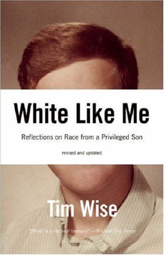
White Like Me
By concealing the identity of this portrait, it leads the viewer at first to wonder “who is this guy?”.
The brilliant placement of the text over his eyes, nose and mouth leaves us with only his hair, skin and shirt as a template to hinge other identities off. After a few moment’s consideration, the viewer realises that in fact, it doesn’t matter who this guy is, as there are many more people interchangable with him. Very clever. Full marks.
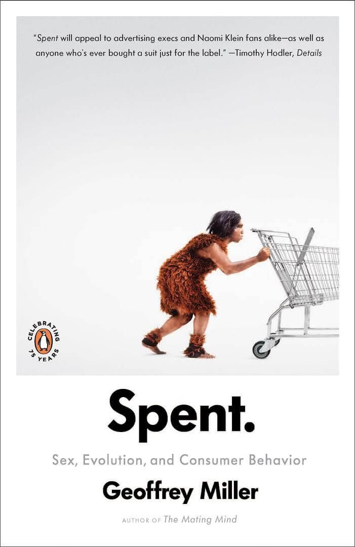
This concept builds the mise-en-scene and labels it so that it may be analysed for it’s meaning. It makes people stop and think, which means they’re investing their time in your book already. This example showing a caveman pushing a shopping cart gets us thinking – “But they didn’t have supermarkets back then… Wait… I think it’s saying something about our hard-wired consumer behaviour… Whoa.” Mind: Blown. Book: Purchased.
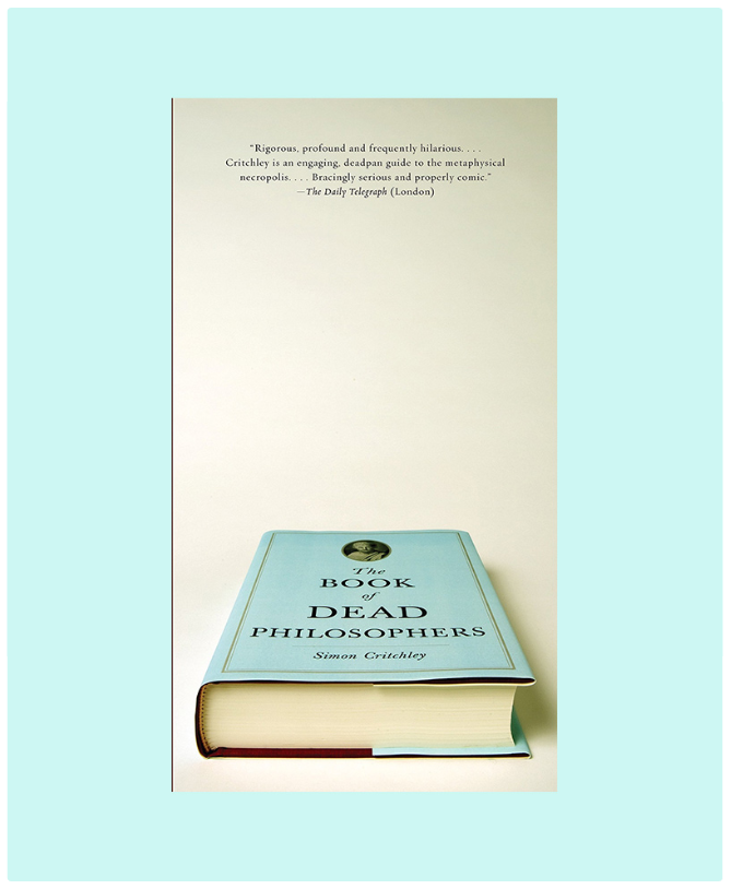
This cover refers to itself ever-so-brilliantly. To the point that I feel perhaps saying too much would ruin the effect… Dead philosophers. The book is flat on it’s back.
I think I’ve ruined it.
Anyway, if you can find a way to get all meta on your concept, run with it. And remember to keep it graphically simple, as the great architect and philosopher Ludwig Mies Van Der Rohe once said, “Less is more”.
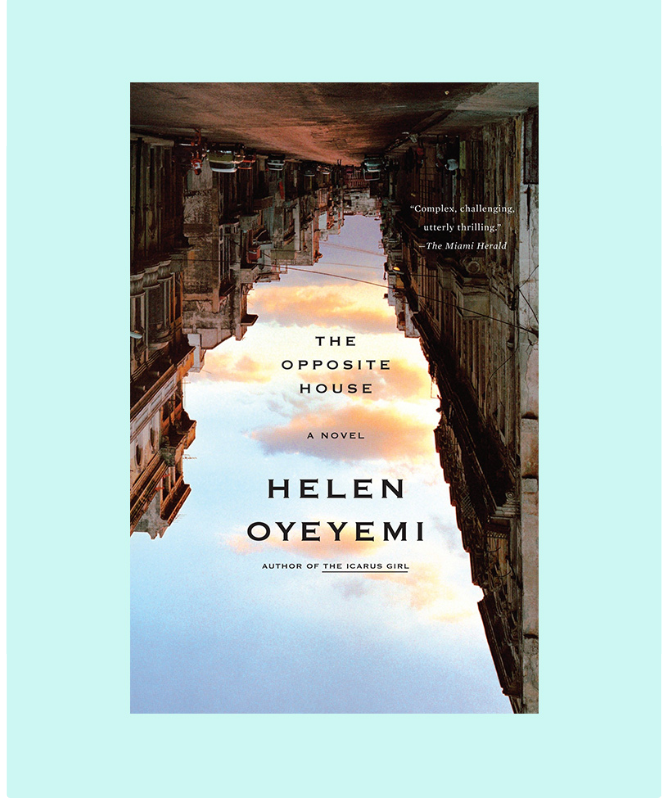
This design really caught my eye as it had my mind doing somersaults – also, extra points for being a clever working of the book title. The sky in the image creates a fantastic shard of light through the composition, creating it’s own version of white space as the house textures are so complex. If you’re at a loss, try turning your image on an angle and see what new meaning that action bestows upon it.
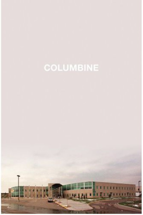
This cover is largely blank with a palate that gives a sense of stillness. By depicting the building itself, it leads the viewer to ponder the lives of those who once felt safe within those walls, while the emptiness above it carries a heavy sense of memorial. It is the simplicity of the composition that is in fact very moving.
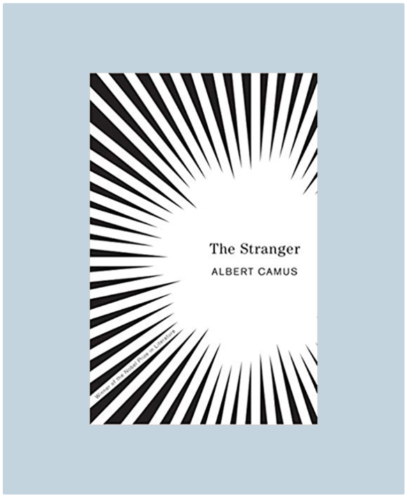
This design gives a strong first-person perspective and draws the viewer’s gaze to the title. There is a sense of danger, of investigation, of being watched or perhaps surrounded. This bold graphic choice that does not rely on photographic imagery can give viewers a wonderfully tense sensation in their stomach, and a yearning to wrap their imaginations around a thriller!
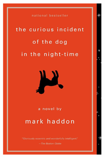
Be it the clearly ironic use of an overall vintage-style, the bold choice of colour or the upside down poodle silhouette, there’s just something about this cover that screams dry humour to me. Simple, effective and polite (which makes me think the book may in fact be a bit rude), it looks like a little treasure that I’ve found in an old book store that is going to teach me some lessons.
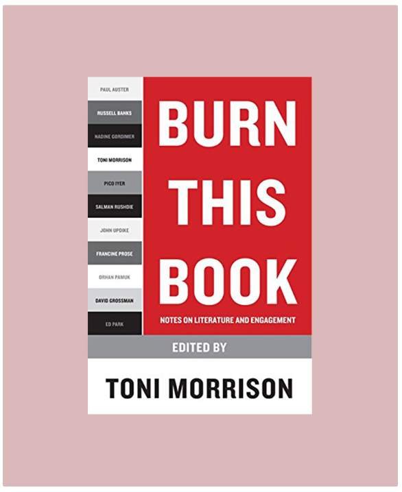
This is the kind of cover that tells me that there are going to be some bold statements made in this book. It orders and challenges its audience, it gets hearts pumping, it gets minds racing, and we haven’t even opened it yet! If yours is a book full of words that form envelope-pushing ideas, let your cover be a direct representation of it.
![Image